byHaus Studio
N/ADecember 19, 2021
Mindsparkle Mag


v
Being part of a creative community involves not only knowing designers or artists. Creativity is so much broad! And in that diversity of inventive minds, some design only in the digital world and others that materialize their ideas and concepts, like with tangible materials. Back with architecture studios, today we're showcasing Archimat brand identity designed by byHAUS studio. Here's their invitation to celebrate the materiality of home.
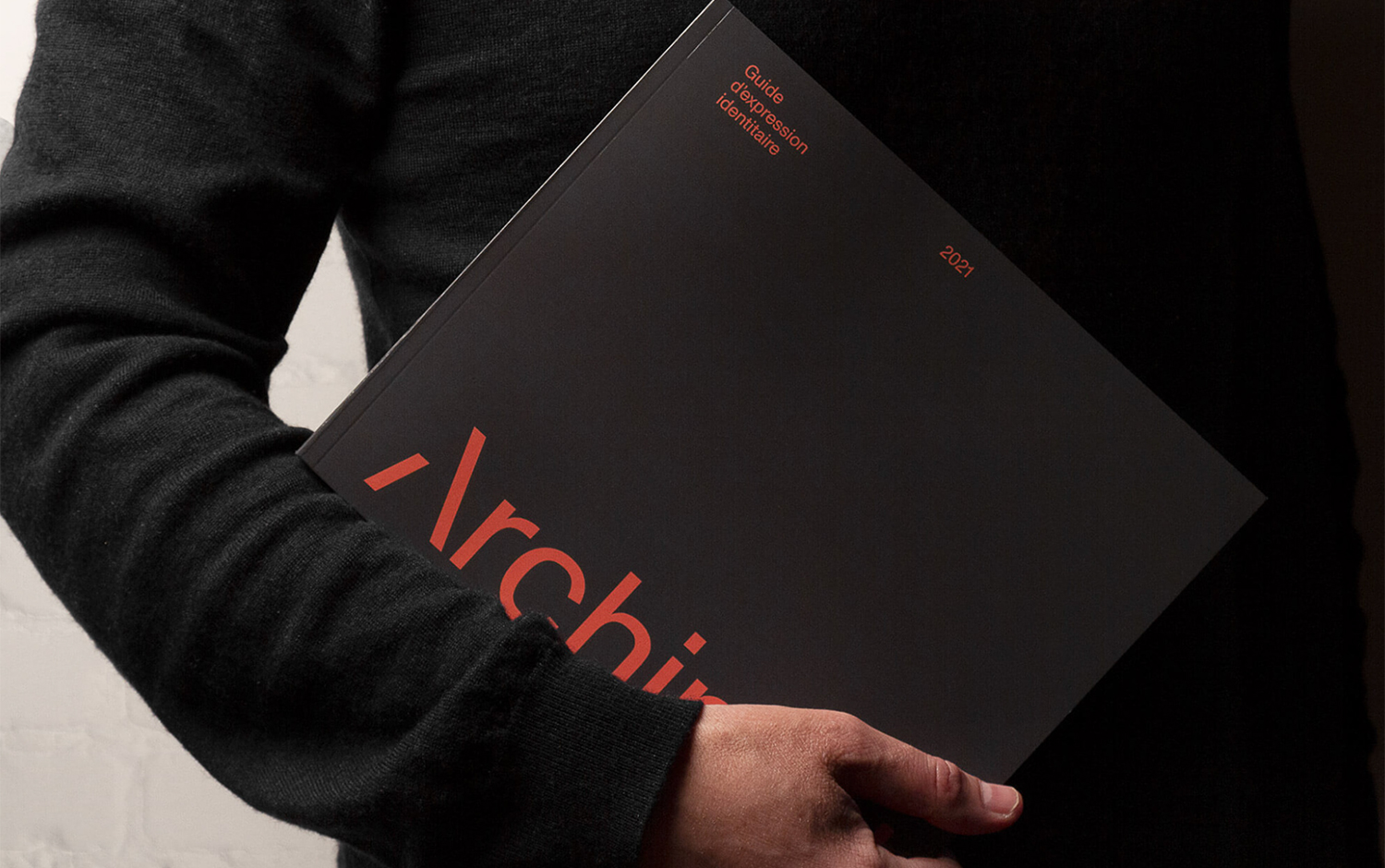
Archimat is a company that specializes in finishing products, and it took the opportunity to enhance its personality and create a recognizable and engaging brand identity. The byHAUS team helped the studio materialize its manifesto: one promotional and the other corporate - making Archimat a true partner of choice. The letter A became the centerpiece for the branding. Present in the new logotype, it perfectly works independently. The new branding bases its composition on a grid, featuring a clean and minimal aesthetic. Is it a coincidence that an architecture studio uses one? We don't think so.
The overall identity for Archimat has an elegant and modern style that stands out from other studios. Plus, the interdisciplinary work between designers and architects has always been fruitful.
Creator: byHaus Studio