Contexto Studio
N/ADecember 09, 2021
Mindsparkle Mag


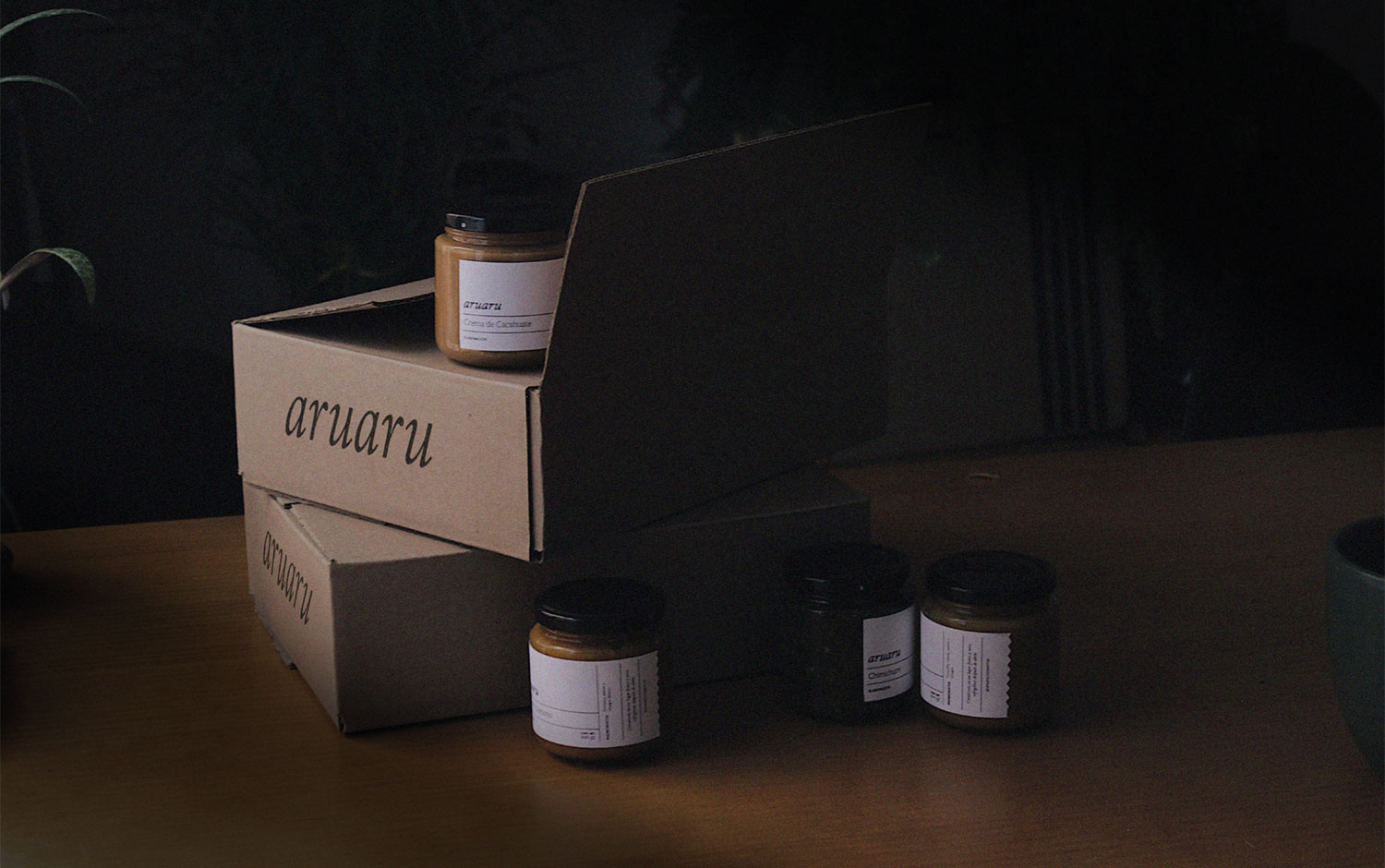
Today, we're taking you to Mexico City to gather information about Aruaru. Homemade in Santa Maria La Ribera, this brand offers all things spreadable, from fruit jams and peanut butter to sauces and other delicious preserves. Each of its products pays tribute to nature, truth, and perfect timing, for which they use local ingredients. To combine and represent all of the above, they asked Contexto Studio to create their visual identity.
Designers worked on a visual identity that unifies Aruaru's essence. They not only developed a graphic system, but they are also the creators of its musical name. Contexto team received inspiration from an exotic and edible plant from the Caribbean. For the logo, creatives made a typographic one, as it reminded them of the good ol' days when production was manually crafted. The packaging itself follows the same line. It was thought to adapt depending on each fruit and vegetable season and provides Aruaru with tons of production freedom. Clean labels, honest messages, and enough space to contemplate these delights through the glass.
Creator: Contexto Studio