LG2
N/AAugust 01, 2024
Mindsparkle Mag


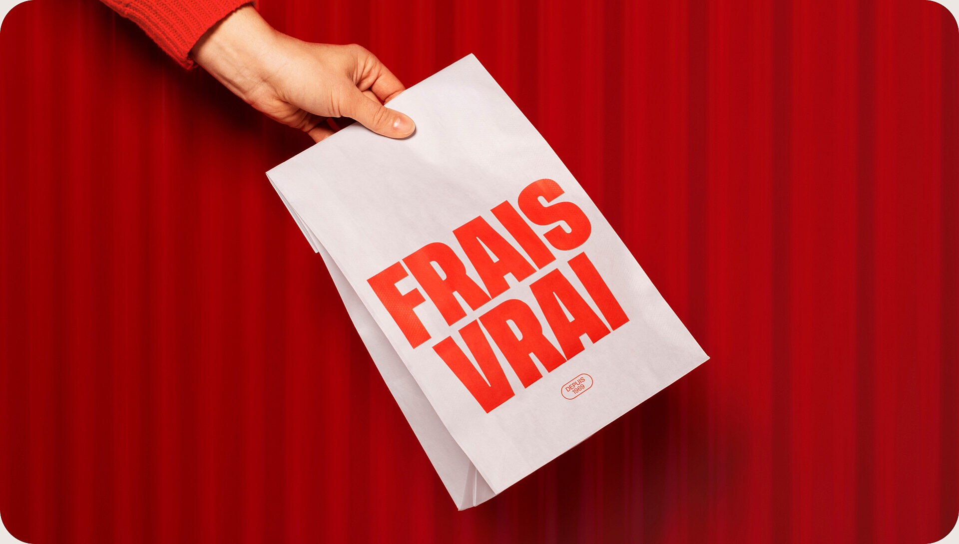
LG2 reimagined Ashton’s entire brand experience at one of its flagship restaurants. Numerous elements were redesigned to simplify the brand as a whole and turn it into an exportable entity. The experience was updated with a perfect blend of modernity and traditions rooted in Ashton’s history.
In tribute to snack bar culture, all the classic codes of diners were integrated with a modern twist. A customized typographic signature emphasizing the generous, indulgent nature of Ashton dishes was created. The triple red line – inspired by the chain’s iconic neon lighting – runs through every touchpoint in the graphic system. To create an atmosphere as comforting as its food, the design concept was completely overhauled. This transformation can be seen from the outer shell to the interior details: the pervasive curves, neon lighting and red tin roof are all reminiscent of Ashton’s original 1969 food truck.
Creator: LG2