Rainfall.
N/ANovember 19, 2017
Mindsparkle Mag


Rainfall created the full brand identity suite for Atlis, including its brand voice, marketing materials, investor presentations and email communications
Atlis is a platform where its community can receive personalized recommendations for almost any type of business, simply by asking - 'In essence, Atlis has brought word of mouth recommendations to the digital space by rewarding quality interactions from its users with cash, status, and most importantly, a trustworthiness score.'
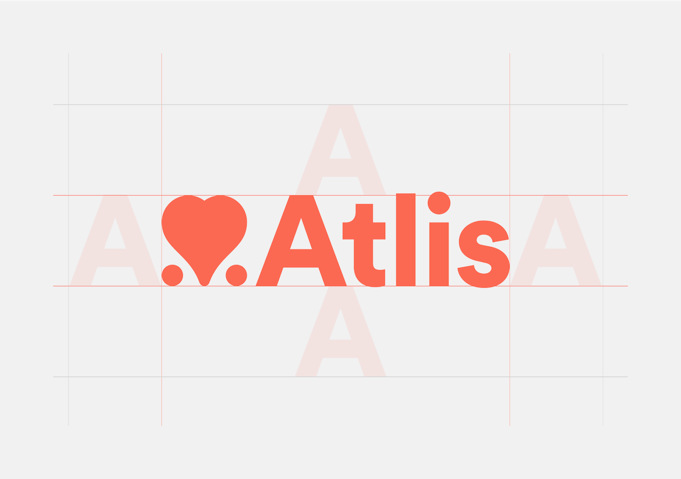
For its logo, Rainfall came up with a heart shape in between two dots, which symbolises the platform’s aim to help its users make informed decisions when given multiple options. 'It is quite simply the love that one shows for one business over another; This mark fits with the company’s aim to strike friendly relationships with both consumers and businesses in order to create a platform that is mutually beneficial.'
Ahead of its initial release, Rainfall aimed to craft an identity that allows Atlis to fit within its product category while still distinguishing itself as unique. Starting off with a bold base colour of variations of red, a more orange-toned hue was selected in order to portray itself as more approachable and unique. Around the red, Rainfall built a family of colours ranging from warm to cool in order to signify the various expressions of Atlis’s messaging service, from friendly to more serious.
Regarding the typeface, Rainfall selected Circular by Laurenz Brunner to emit an approachable and friendly manner while remaining sophisticated and reflecting Atlis’s core values of democratization and trust.
Creator: Rainfall.