Designsake Studio
N/AOctober 19, 2021
Mindsparkle Mag


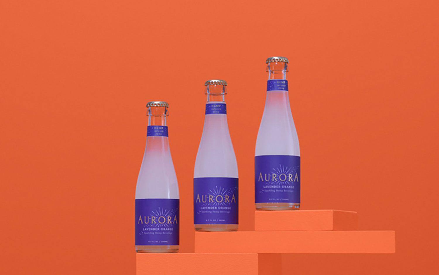
You know guys, on Tuesdays, we like celebrating with our Top 10 so to complement this occasion we thought of featuring a beverage which can be drunk in the office. Here to you, Aurora's identity, a non-alcoholic sparkling beverage packaging brand. Designsake Studio developed its new line of hops-infused beverages label design.
The studio was also in charge of its art direction, copywriting, illustration, and packaging. They managed to position Aurora in an elevated stage based on its feels and flavors. Mainly, designers focused on a fresh packaging design and prominently communicated its profile. So, Designsake renewed its logo and added custom illustrations for its visual identity. These illustrations add a handcrafted approach that uniquely adds more value to its image, communicating Aurora's flavors. The vision was to unify the system for the brand's future product growth. The new color palette features a unique color combo, in which all four tones perfectly match the golden details. Plus, the art direction depicts a super fancy scenario, where unique ceramic pieces and elegant glasses share the stage with the bottles.
The overall Aurora's visual identity gives a magical feel when opening one of its bottles. We're definitely looking for some of them to celebrate tonight's Top 10. And we love the high-end, metallic details that give the brand an exclusive appeal.
Creator: Designsake Studio