Soul Studio
N/AAugust 20, 2021
Mindsparkle Mag


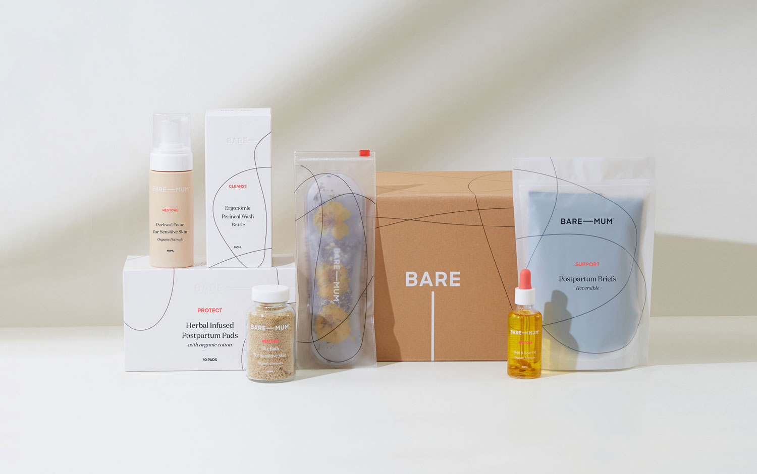
While the pregnancy and the newborn market is one of the most crowded markets, the postpartum sector is often overlooked. Information is scarce, and millennial pink faded outdated products that don’t address the needs of new mothers. Set with an intention to demystify and destigmatize, Bare Mum has developed a range of clinically approved products to assist mothers during this transformative period.
Soul Studio's created a brand built around empowerment. They developed Bare Mum with this in mind, infusing that feeling into every aspect of the brand; the name, the stereotype-breaking color palette, credible language, and clinically-skewed packaging designed to highlight the efficacy of the products. Along with the brand's founders, Soul Studio wanted to show some human touches and vulnerability in its design to represent motherhood with authenticity. We love how the packaging has a natural and fresh style, featuring a wonderful almost, neutral color palette. The organic kind-of-doodly lines give the boxes a fun imprint. Plus, the translucent plastic bags add a blurry effect that increases the quality perceived.
An overall great work from Soul Studio's designers who managed to resolve Bare Mum's brief with excellence. Also, the brand's message is well communicated all over its products and digital platforms. We're happy to showcase this type of brand and their identity, as they want to bring something new to the table :)
Additional credits Product Photography & Videography: Morning Swim Studio Lifestyle Photography: Tash Whitty
Creator: Soul Studio