Re Agency
N/AOctober 10, 2017
Mindsparkle Mag


'In Sydney, a new café opens every six minutes (or so it seems). For their new venture in Sydney’s inner west, the Cho family needed a personality and philosophy that would connect with spoilt-for-choice Sydneysiders. In consultation with Re, the family articulated the essence of what they wanted to create: A café that respects the origins of every ingredient, tinkering just enough to showcase their natural beauty. A place where what you see is what you get. It was Re’s task to create an identity to bring this vision to life.
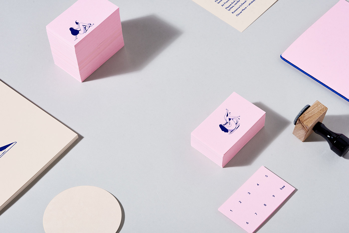
As the name suggests, cafégoers can come to Bare Witness to see food in its purest form. Their ethos of 'baring all' means open kitchens, sharing knowledge and leaving little to the imagination. A series of illustrations by Christopher DeLorenzo forms the centrepiece of the identity and interiors. Christopher draws beautiful, curvaceous figures by hand, so his work has natural texture and little quirks that make it appealingly imperfect. These are complemented by the simple geometry of the Ano font, which brings its own eccentricities. The identity is pared back yet filled with character. Just like Bare Witness.'
Creator: Re Agency