Super Studio by Carolane Godbout
N/AJuly 05, 2023
Mindsparkle Mag


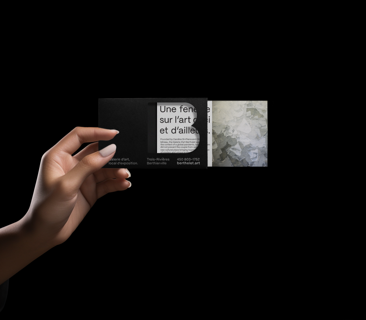
Super Studio has recently undergone a branding overhaul for Berthelet.art, a gallery known for showcasing thought-provoking and visually stunning contemporary art. The new logo, featuring a giant letter B, is a bold and striking statement that perfectly encapsulates the gallery's ethos.The B logotype is no ordinary letter. It's a window to the art world, perforated and allowing glimpses of the artists work to peek through.
The perforations in the letter B create a sense of curiosity and intrigue, inviting the viewer to come closer and explore further. On the front window of the gallery, the diecut acts as an invitation to the visitors to experience the art world in a unique way, through the eyes of Berthelet.art Gallery.The frame that surrounds the mark in the new main logo is not just a design choice. It symbolizes what holds the artwork and makes it be the focus. The frame is a representation of the gallery's dedication to showcasing contemporary art that is not just visually stunning but also thought-provoking. It is a reminder that the art world is not just about aesthetics, but also about the ideas and concepts behind the artwork.
Creator: Super Studio by Carolane Godbout