Ben Galbraith
N/ADecember 20, 2021
Mindsparkle Mag


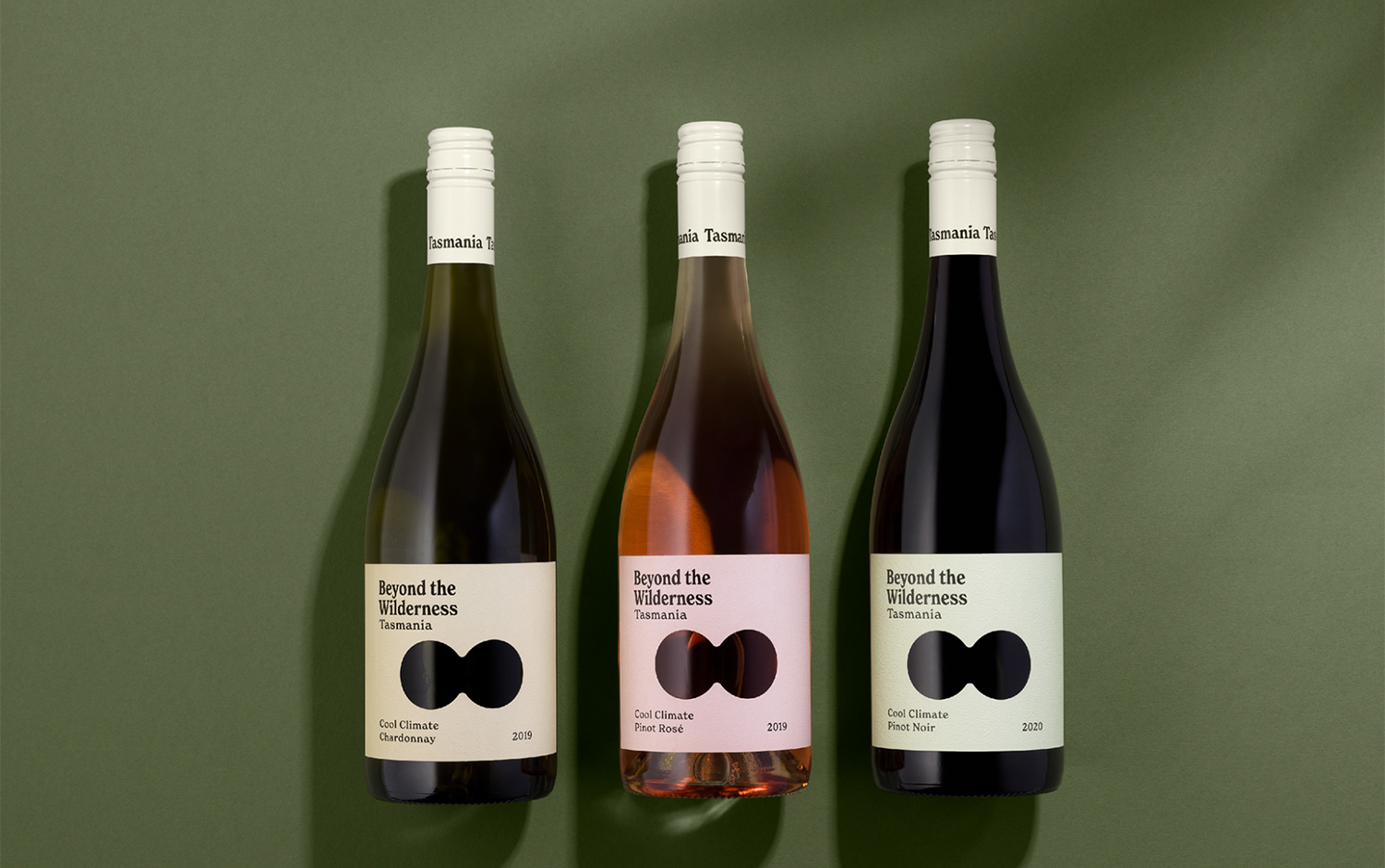
From the most adventurous country with the most feared animals and insects, we say 'Howdy?'. Back in 2020, we remember Australia's fires before the pandemic. However, not all of the territory lives under the same climate conditions. Southwards, there's a famous island called Tasmania, unlike any other place in the world. Well, if you have any doubt, here's the brand identity and packaging by Ben Galbraith we're featuring today: Beyond The Wilderness.
What characterizes this place is its climate, specifically its powerful winds, aka the Roaring Forties, which bring life to still seas and bend trees. However, most of the territory consists of impenetrable forests, from which a local myth is born: The Tasmanian Tiger. Inspired by this tale, Ben came up with a magical, mystical concept for Beyond The Wilderness winery. The visual identity features a simple diecut that functionally shows off the wine but also serves as a metaphor for looking into the wilderness. A nostalgic font complements its unique, textured label. The color palette is dreamy! The pastel tones give a story-tale aesthetic that reminds us of bedtime when we were children.
The overall matt varnish and the label's embossed texture give extra high quality to the finished product. Above all, we love the background story about Beyond The Wilderness identity and how a geographic condition can produce such a stunning graphic design.
Additional credits Illustrations Steve Gavan
Creator: Ben Galbraith