New Office Design
N/AOctober 16, 2018
Mindsparkle Mag


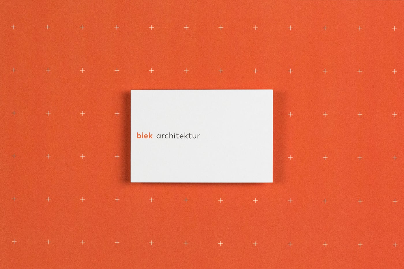
Beautiful identity design for Biek Architektur by New Office in Germany.
Konstantin Biek has been realizing projects in the fields of modernization of buildings, extension of existing buildings, single-family homes and multi-story multi-family buildings since 1999 with his Frankfurt office.
In order to be able to present themselves and the various projects in a contemporary way, the customer wanted a new look that was independent and at the same time withdrawn in order not to compete with the projects shown.
The result is a logo that subtly picks up on the theme of "space" through the extended space between the customer's name and the industry name, and thus has a thematic relationship despite the reduced appearance.
The corporate design relies on a lot of white space and full-surface color with a fine pattern that also takes up the themes of "architecture" and "space" through the area-defining crosses.
Creator: New Office Design