Here
N/ASeptember 27, 2023
Mindsparkle Mag


Family-run English country garden Borde Hill has seen its fair share of history over the last 400 years. However, when design agency Here partnered with them it was during a pivotal moment in their own history, one of reinvention. Once a place to visit and admire the abundant gardens, the destination is evolving to include a broader outdoor education programme and hospitality offer with the ambition of connecting communities with the restorative power of nature. Here were tasked to refresh Borde Hill’s positioning, identity and tone of voice to reflect their progressive vision for the future.
The strategic and creative challenge was to appeal to a broad audience – to school children, local community growers and hospitality guests alike. The creative idea needed to be both egalitarian and aspirational.
The strategic idea of Joyous Balance, inspired by a nature-first approach that lets the natural world find its balance, opened-up an engaging visual language. It draws on the informality and playfulness within the garden rooms. A visual world abundant in natural charm, moments of joy, spontaneity, surprise and discovery. At Borde Hill every story has its place, in a diverse, alive, ever evolving and inviting landscape. This approach inspired every aspect of the creative package from the fluid, expressive typeface to the icons, colour palette, digital assets and tone of voice.
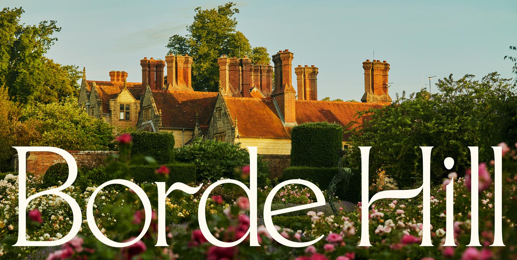
Here incorporated natural imperfections into each element of the brand identity, but only apparent when carefully studied. Like a garden, Here wanted to reward people leaning in and noticing little moments of natural beauty throughout the brand toolkit. The design of the new wordmark was inspired by nature, looking at the form of leaves and stems. Here crafted each of the characters using contrasting widths to add a sense of rhythm and growth. The dot of the "i" is a subtle nod to a seed, bringing moments of unexpected joy to the brand. Wide, open counters add elegance and lightness, while the short serifs help the word mark feel grounded yet contemporary.
An emmenopterys enryi, first planted in the UK at Borde Hill in 1928, has been elegantly illustrated and woven into the monogram and hero icon. A set of bold graphic icons to represent each of the areas within Borde Hill were also illustrated and applied to collateral across the estate – helping visitors navigate and discover new areas.
Pops of colour – magnolia pink, bud green, sunshine yellow – are paired with rich dark tones and soft pastels and used alongside beautiful new photography by photographer Emli Bendixen, used throughout collateral, website and social media.
Inspired by Borde Hill’s egalitarian approach and universal appeal, the brand needed a voice that would speak to all – from families to foodies, and locals to London day trippers alike. Channelling the strategic thinking of being charming, surprising, playful and informal, this new voice is warm and welcoming, with an unexpected twist to it.
Here started with a headline that would reflect all this ‘A Garden of Possibility’. This new line reflected the abundant array of experiences on offer and Borde Hill’s exciting future. All this helped to give the brand a much-needed nurture and power their ambitious vision. A joyful balance of elements coming to life in all the right places.
Creator: Here