Daniel Freytag + Greig Anderson
N/AAugust 18, 2018
Mindsparkle Mag


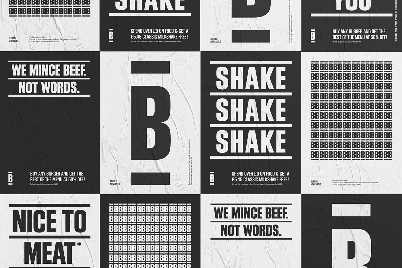
Beautiful minimal branding for a burger bar in Glasgow, created by Daniel Freytag and Greig Anderson.
A restaurant with operations in Edinburgh, St Andrew’s and Newcastle, BURGER’s offering is simple. Great burgers. That’s it. The name called for a no-nonsense approach and the designers began the brand development with some stripped-back typography. Leading unapologetically with ‘BURGER’ created a sense of ownership over the word in a competitive space. With origins in woodblock printing, the Block Gothic font had the right overtones of craft and robustness. A simple word-mark can condense to a ‘bun’ in its simplest form, and expand horizontally or vertically to let the name do the talking.
The origins of the burger are much debated, with variants appearing in the early 1700s and ‘Hamburg steak’ made popular in 19th-century America by German emigrants. Several restaurateurs and lunch vendors claimed to have created the hamburger as we’d recognize it between 1885 and 1900. Various chain restaurants sold large numbers in the 1920s and ’30s - culminating in the establishment of McDonald’s in 1940.
An affordable, handily-sized package, the joy of the burger is in its utility as a practical ‘people’s food’. In designing BURGER’s identity the designers wanted to present the product as just that. The confident, sturdy functionality of Block Gothic - influenced by old printing-press letter blocks - was a characterful match for the BURGER brand.
Creator: Daniel Freytag + Greig Anderson