Daniel Britton
N/AFebruary 23, 2022
Mindsparkle Mag


So, industrial aesthetics is not for everyone, and today, we're going 110% into this style. Meet Centre 31's, an industrial warehouse in the north of England. Its branding comes from Daniel Britton's creative mind. We find it relevant quoting Miley's song and "shuffling into the diagonals" as this visual identity is all about them.
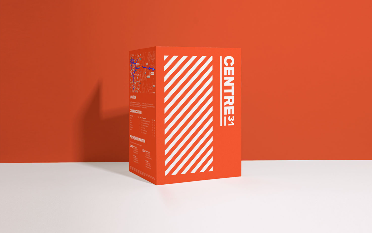
We're excited about this project as it doesn't feature the usual branding elements. Daniel showcases Centre 31's identity in subtle ways all over the warehouse. Featuring a strident red color is how the diagonals come alive! It's super cool to witness how branding is applied on a giant scale :) Centre 31 is an industrial warehouse in the north of England, specifically on junction 31 of the M26 in a prime distribution location. The brand is bold and cheerful while donning a classic industrial look and feel. The brand takes ownership of the classic, industrial 45-degree warning lines and sees this become the foundation of the brand's visual system.
Additional credits Agency: Cormack Designer: Daniel Britton Client: Kennedy Wilson
Creator: Daniel Britton