Diferente
N/AMay 25, 2018
Mindsparkle Mag


Beautiful branding project by
, in Barcelona.
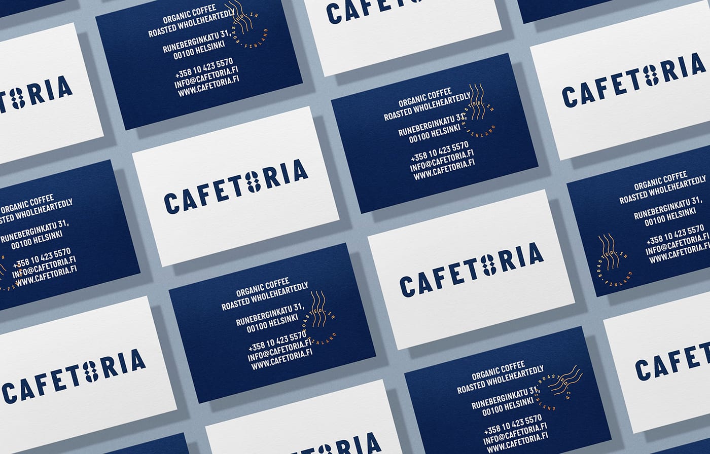
Cafetoria is a coffee roaster in Helsinki with a goal: offer to their customers high-quality organic coffee with certified origin while is promoted the fair trade, social development and environmental protection of small coffee farms in Latin America.
The problem found in the analysis is that Cafetoria offers a great coffee but their brand image is not coherent with the business idea and either communicates the character of a Nordic company with Latin roots.
As a solution, Diferente proposed a totally new visual language for the brand based on a symbol: a coffee bean that integrates the simplicity and Nordic perfection with the allure and modular repetition of the latin ethnic crafts.
The modules taken from the symbol are used to generate different icons that illustrate brand messages as well coffee origins in the labels of the packaging —where a roast certification seal is used to stamp white and blue bags that distinguish filter and espresso roasts.
The result is a minimalist brand image with a Latin touch that stands out a premium handmade product roasted wholeheartedly in Finland.
Creator: Diferente