Drogheria Studio
N/AJune 14, 2021
Mindsparkle Mag


Time. The most valuable currency of our times. It is also one of the essential aspects characterizing wine production. I Carpini is a winery characterized by a holistic approach and for respecting the time its process takes.
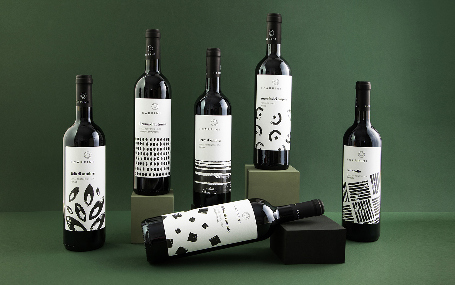
For them, wine production means time, care, and closeness to the land. Not following the standard processes. The new brand identity designed for them by Drogheria Studio wants to communicate all the poetry behind their wines, composed of patience, balance, and respect for nature. The logo, defined by two circles, communicates the rotation and the passing of the time required by the wine to find its perfection. It can also be viewed as a glass seen in perspective from above.
Their vineyard is located in the Tortonesi Apennines, Italy in an uncontaminated context, where the winemakers take care of the ecosystem respecting the biodiversity. So, each label is named after a poem that has been interpreted graphically and re-created using handmade stamps to stay near the earth-bound soul of the product.
Labels have been designed using the stamp technique. For each label, it's been designed a figure that illustrates the name of the wine and its history. Highlighting the love and passion the winery puts on their product, it was also reflected on the names, inspired by poems and all the romance behind them. Moreover, the handcrafted work for the branding involves hand-pressed inked stamps on paper and later processed digitally. The brand identity presents four different rotations, each one for every vineyard, displayed on different labels and simulating the concept of the time and the lunar phases.
Creator: Drogheria Studio