TSUBAKI KL
N/AAugust 23, 2020
Mindsparkle Mag


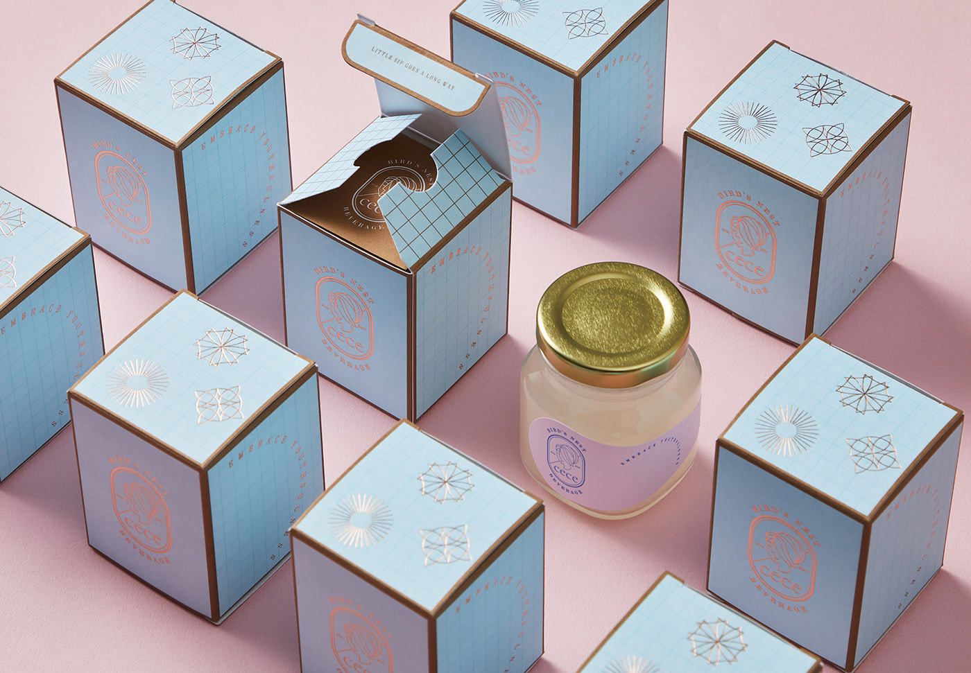
TSUBAKI KL designed Cece Birds Nest Beverage. Cece is a beverage brand that started in Malaysia by Madam WK Heng, serving high quality bird’s nest drink since 2007. Cece has been a healthy choice among young urban women and pregnant mothers for more than 13 years. The brand identity that was created for CECE features a cool colour palette that alludes to the product’s health benefits and its delicacy.
The logo comprises an elegant one-line face art of a female portrait and an allure of classic serif typeface that spell outs the brand name. The charming identity of Cece extends to a series of portraits of the same female icon, each representing the different normal daily activities experienced by a woman – such as reading a book, staying connected on the go with a smartphone, staying hydrated for good health, or simply taking care of herself – whilst keeping a youthful outlook.
The word “Cece” originated from “yat see see”, which literally means “shreds” in Cantonese. The meaning of “Cece” is two-fold: It is symbolic of the nest-building activity by the swiftlets whereby strands of bird saliva is used to build the nest. It is also about the process of cleaning the bird’s nest whereby manual labour is acquired to do quality control, inspecting the bird’s nest strand by strand before the product goes to market.
Creator: TSUBAKI KL