FatFaceStudio
N/AMay 12, 2020
Mindsparkle Mag


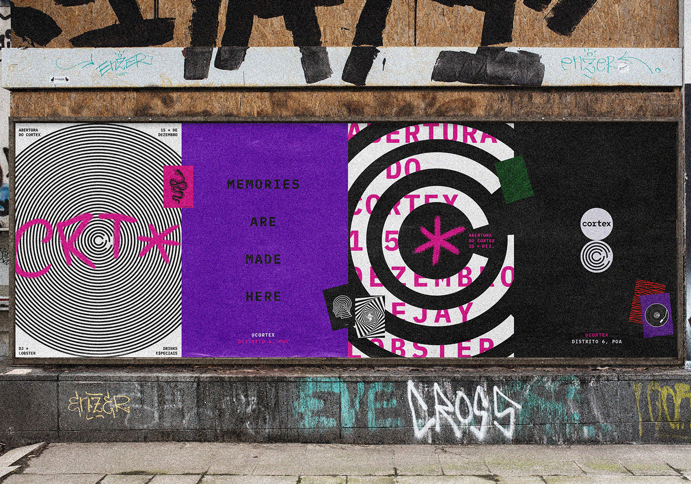
FatFaceStudio designed Cortex Bar. When a duo of event producers from Porto Alegre, Brazil decided to open a new venue to celebrate the music from the good, not-so-old times of the early 2000's, they named it Cortex – the part of the brain responsible for, among other things, store memories.
These guys used to throw parties back in the day when My Chemical Romance, the Klaxons and Franz Ferdinand were banging loud in the years of 18 to 20-somethings all over the place.
The people that used to go to their parties are now working their asses off and most nights end up choosing to Netflix and chill over going out to dance. Cortex came to change that.
For the visual identity, the client chose to go for the one we nicknamed "Clean Punk Rocker" – a clean, indirect and grown-up assembly of elements from alternative rock music from the early 2000's. This definition paved the way for the visual language, since the colour palette, typography and graphic elements were already approved.
As for the mark, they discussed how to visually explore the cerebral cortex and decided to stay away from the anatomy of the brain and go for a more abstract approach. During our research, designers frequently encountered the analogy of the mind as a labyrinth, and that was the chosen path to design the brand mark. The idea of labyrinth, mixed with symbols of rebellion used in the visual language, connected beautifully with the concept of escaping reality we previously identified.
Creator: FatFaceStudio