Studio TipTop Christian Perner & Saskia Schmidt
N/AJune 22, 2023
Mindsparkle Mag


CORTOLEZIS is a business law firm and property management company simultaneously. The traditional firm has chosen to take new paths, which led them to this logical next step with a young team, including a new young partner. The new rebranding, by Studio TipTop, aims to reflect absolute professionalism, expertise, and excellent client care. Special attention was given to production, with individually designed company signage, hoodies, and various printed materials.
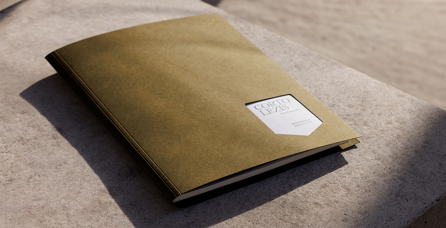
CORTOLEZIS is where business law and property management converge. The previous logo consisted of a legal case number, which, when flipped, transformed into a house, representing the property management aspect. This concept was retained.The foundation of the new branding includes muted colors, a combination of two elegant fonts, a recognizable photographic style, high-quality materials, and the two symbols (house and legal case number). On the website, still lifes come to life through subtle movements. No compromises were made in the production of touchpoints either - door signs, file folders, and bags were individually and meticulously designed. Each partner has their own file folder, which represents the firm in court and is a novelty.