Moby Digg
N/AAugust 06, 2019
Mindsparkle Mag


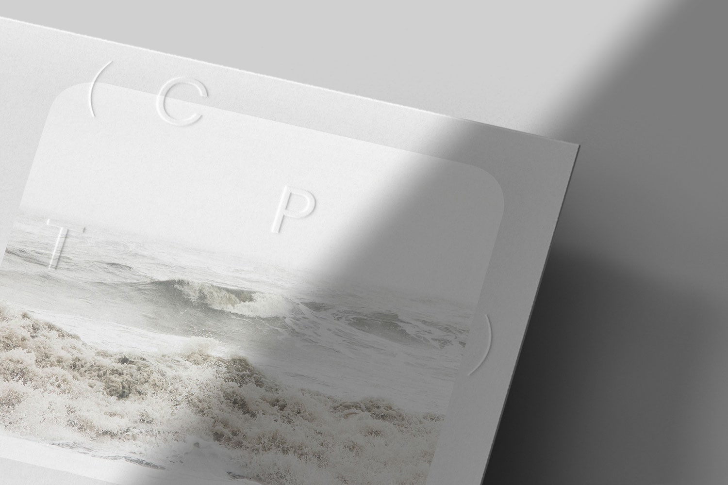
Moby Digg designed the Branding, Website Design & Development Logo for CPT. Reflecting the center’s dynamic DIY approach, the logo builds on the acronym (CPT) whereby letters can be arranged freely within the system and are framed by parentheses. Their research into language and expression of ideas through typography led the conceptual rediscovery of parentheses. This variable branding system can be used both statically and animated, adapting to various formats and spacial contexts, but moreover it can easily be typed out and used together with research texts, or claims, creating connected streams of thought.
Identity: The website backgrounds build an analogy to Arizona's desert landscape, embodying a view to the far horizon. They used blur, to emphasize the intersection of disciplines at CPT and the vast information clouds … The resulting compositions of the logo, loose type and bubbles create a brand identity, that should invite free associations in the poetic vastness of philosophy and gestalt.
Creator: Moby Digg