Glasfurd + Walker
N/ANovember 23, 2016
Mindsparkle Mag


Earls
is a well-established, family-owned, premium casual restaurant chain with 66 locations around Canada and the US. They’ve been at the leading edge of customer care and dining culture for the past thirty years.
Earls
commissioned Glasfurd + Walker and interior design studio, Ste Marie —to reimagine the brand in a one off prototype restaurant – called
Earls
.67.
Earls
67 became a place where new ideas in food, service, and décor could be developed and tested by the company then roll successes into the other 66 restaurants and essentially reinvigorate their thirty year old brand. The overall concept is inspired by everything that’s made
Earls
what it is today: burgers to bustling bars, food with an international twist, experimentation, energy and the constant effort to make things as good as possible for guests and employees. In order to articulate a new identity, Glasfurd & Walker chose to go back to the basics, we took inspiration from the company’s history, and refocused it through a contemporary lens, creating a brand that represents the next iteration of the existing
Earls
narrative.
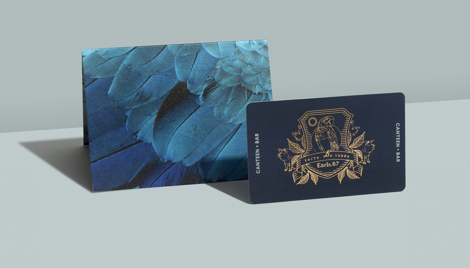
developed a heraldic crest as the core brand mark. At first glance it’s sophisticated and stately, but upon a closer look you realize that it’s populated with parrots, pigs and rhinos; animal mascots familiar to any customer who’s grown up around
Earls
. The motto
Facta Non Verba
—Deeds not Words—sits in the crest as a reminder that actions are the embodiment of the brand. The parrot at the centre is a nod to the original
Earls
restaurant, which was memorably accessorised by oversized parrots (
)…. Even now, no one knows quite how they came to be there, but that’s part of the point, and they are much-loved
Earls
icons.
Creator: Glasfurd + Walker