Kati Forner
N/AAugust 08, 2021
Mindsparkle Mag


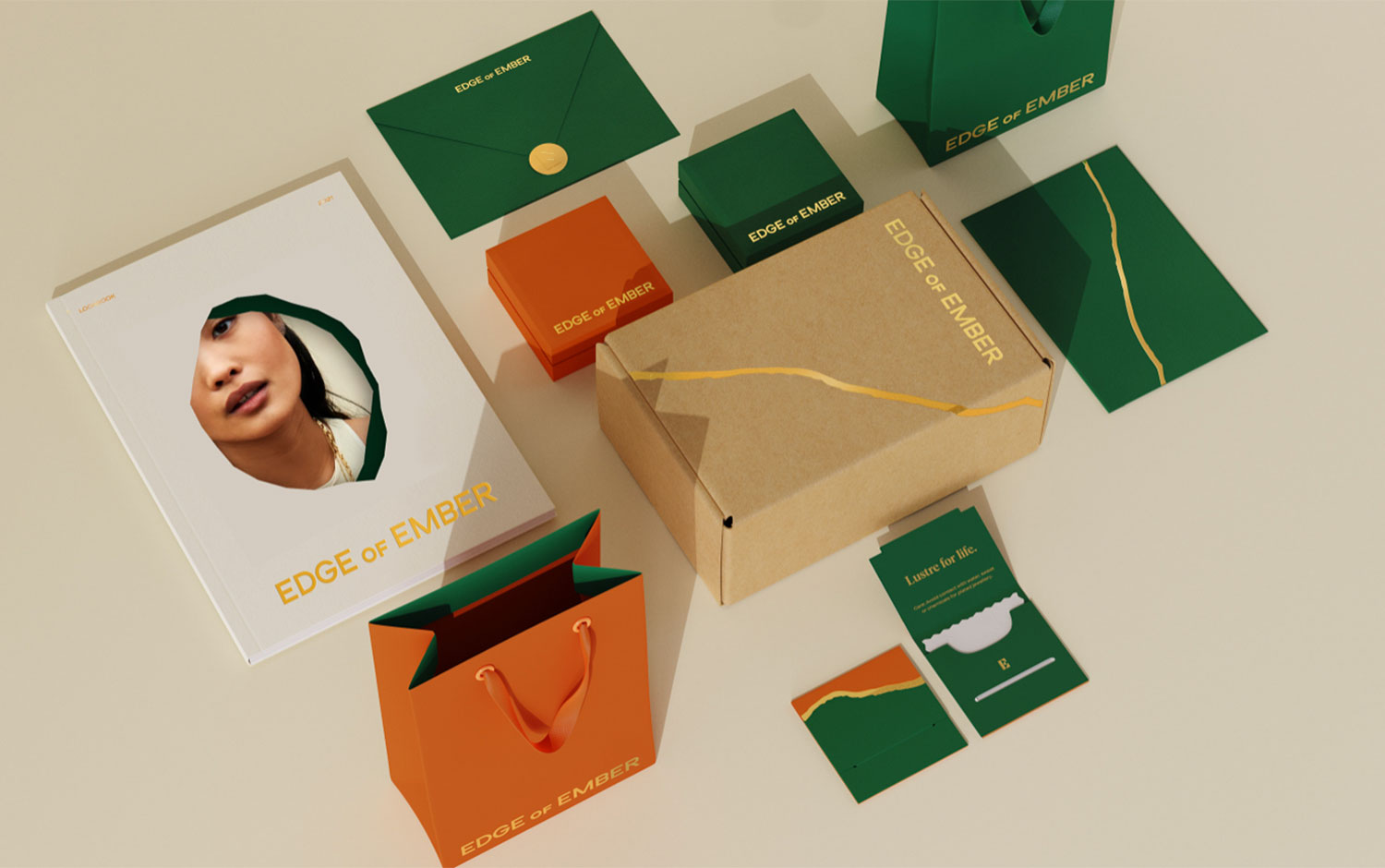
Today we're featuring a branding project led by the outstanding designer Kati Forner and her team. The well-known jewelry brand Edge of Ember asked them to create a head-to-toe brand identity. Responsible not only with the environment but with its employees, Edge of Ember is conscientious about every process in its production. They can make customizable pieces and can give them the jewelry you no longer use to make them circulate again.
When putting the community first, Edge od Ember has deep-rooted values, and we can appreciate that from their graphic and communication style. Bright-natural gemstones' colors form part of Kati Forner's color palette for this branding project. We are fascinated by its boldness. Starting from the very outside of the jewelry's presentation designers, transformed an ordinary brown packaging box into a glamorous one with golden organic details. These brilliant lines link us to the shape precious stones have when cut in halves. Going further on the unboxing process, we find a monochromatic inside, green or orange, featuring the golden details and brand's name.
Last but not least, there's a small, printed art piece that perfectly fits the jewelry box. Plus, the care instructions are super cute. Bewitched by the whole concept creatives came up with, this is our invitation for you to scroll down and check out this incredible work.
Kati Forner has more than twelve years' experience bringing brands to their fullest expression through identity, print, digital design, and production. Starting her design career in Chicago, Kati brought her deep understanding of contemporary and classical design to some of the city's most innovative agencies.
Creator: Kati Forner