Mother Design, Matt van Leeuwen & Yaya Xu
N/AJuly 27, 2019
Mindsparkle Mag


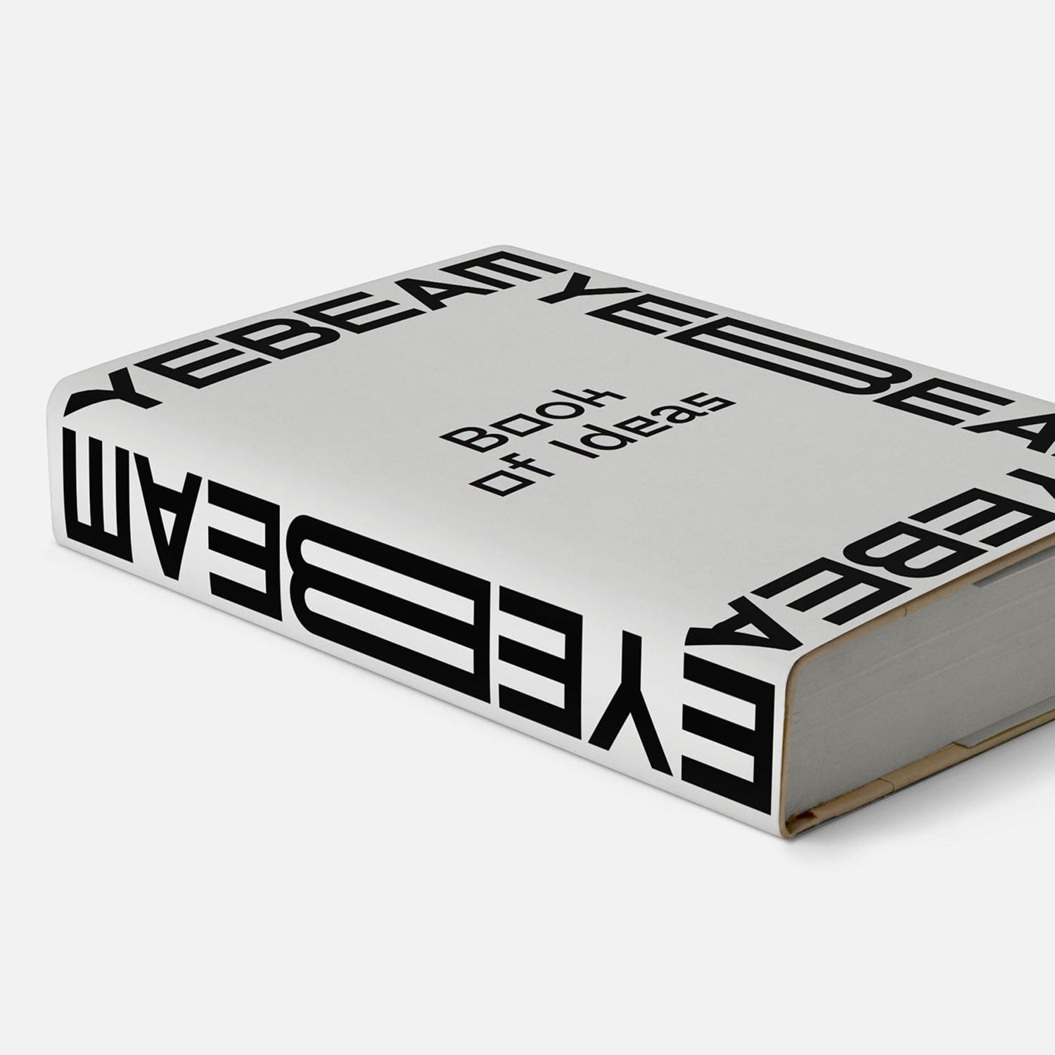
In the years leading up to their 20th anniversary, Eyebeam had grown from a space for artistic experimentation to a multidisciplinary nonprofit that pioneers social justice through the intersection of art and technology. Today, Eyebeam facilitates a flagship residency program, boundless educational resources, community engagement, and so much more. However, their old visual identity and brand was limited in its ability to represent and speak to the scope of the organization and the significance of its work.
Eyebeam engaged Mother Design to build a new brand that could contain, communicate, and unify the many dimensions of their modern brand while charting a bold vision for their future. One of Mother Design’s first goals was to dive deep into understanding what it is like as an artist or practitioner to engage with Eyebeam. We articulated a series of key defining languages and carved out insights that gave definition to the brand and informed our the visual identity.