Caserne
N/AFebruary 11, 2022
Mindsparkle Mag


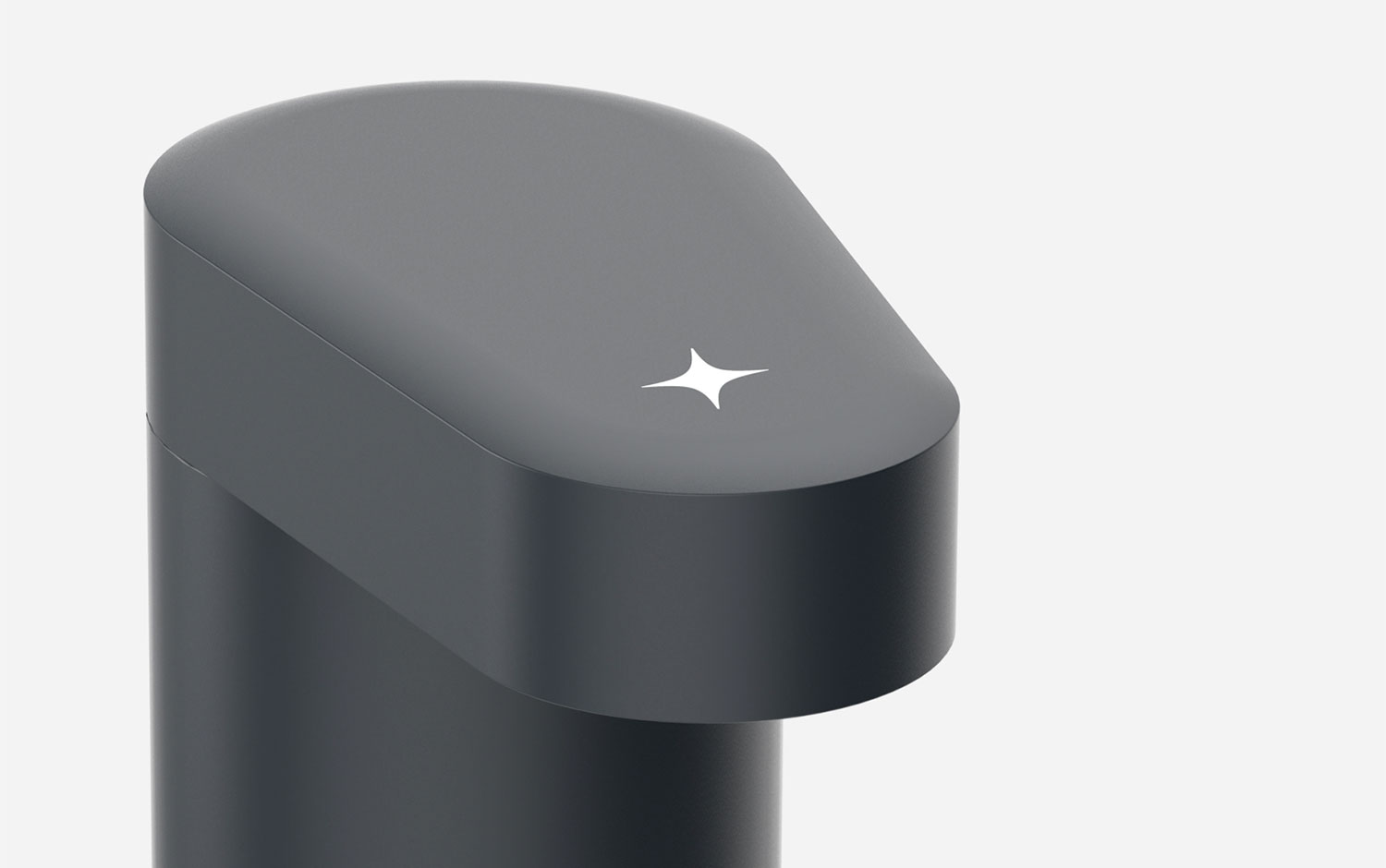
Start bright—Flaco is a product built to disrupt the sanitary sector with distinctive elegance and purpose. A solution focused on quality design and durability was long overdue. The precise and unique shape of the product led us to the development of the name Flaco, which means skinny.
Caserne developed the brand platform to magnify engineering at its finest, and the symbol forms a spark that goes back to Flaco's mission: offer a brilliant welcome. With an old-school illustration style, the creative team managed to combine a super clean morphologic product with this kind of communication system making it unique in the market. Plus, the graphic system includes a characterizing feature, a four-pointed star that it's also applied a the very top of this hygienic dispenser.
Additional credits Photography: Richmond Lam, Arsenik Hamzin Illustrations: Benjamin Lamingo Brand Strategy + Naming + Copywriting: La Cursive Industrial Design: Barbeau Desrosiers
Creator: Caserne