Darling Visual Communications
N/AJune 03, 2021
Mindsparkle Mag


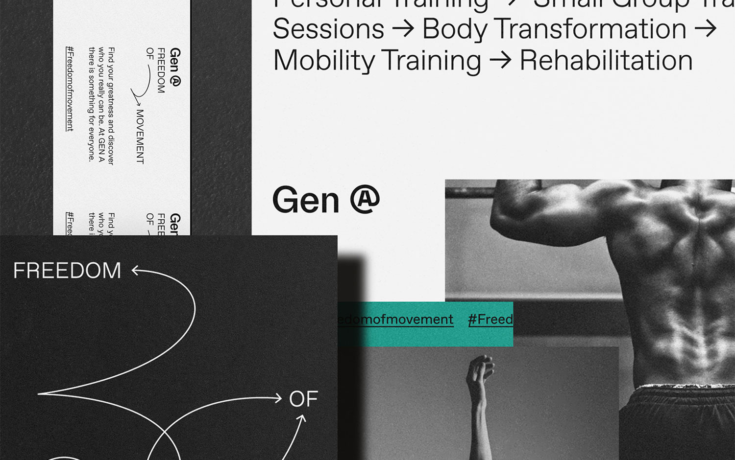
Gen A's vision of fitness is a holistic one — combining strength, balance, flexibility, and mobility with an innate understanding of how to make the bodywork bring about the freedom of movement. Darling Visual Communications created a simple visual identity centered on an iconic logo and clean typography to elevate the brand above typical fitness industry cliches. Multidirectional lines come together to create an iconic symbol visualizing how Gen A's special fitness regimes build strength and mobility. The brand is simple and iconic and is used across the system in a way that will build recognition over time. The color palette hinges on a single rich teal for its distinct quality amongst the existing fitness landscape. Dark-and-teal business cards are something to look up to plus the way they evoke movement is through a high-spirited arrow. Typography is neutral, meant to lend stability to the new approach of fitness while evoking a sense of openness and comfort.
Darling — an interdisciplinary design consultancy firm based in Singapore. Established across the domains of branding, print, typography, website design, and spatial installations. Meticulous attention to art direction and craft is part of the package. Continuous re-education produces refreshed creative processes. For them, there’s always that reconnection between culture, design,, and technology.
Creator: Darling Visual Communications