Kevin Rosales & Oliver Simon
N/ASeptember 06, 2021
Mindsparkle Mag


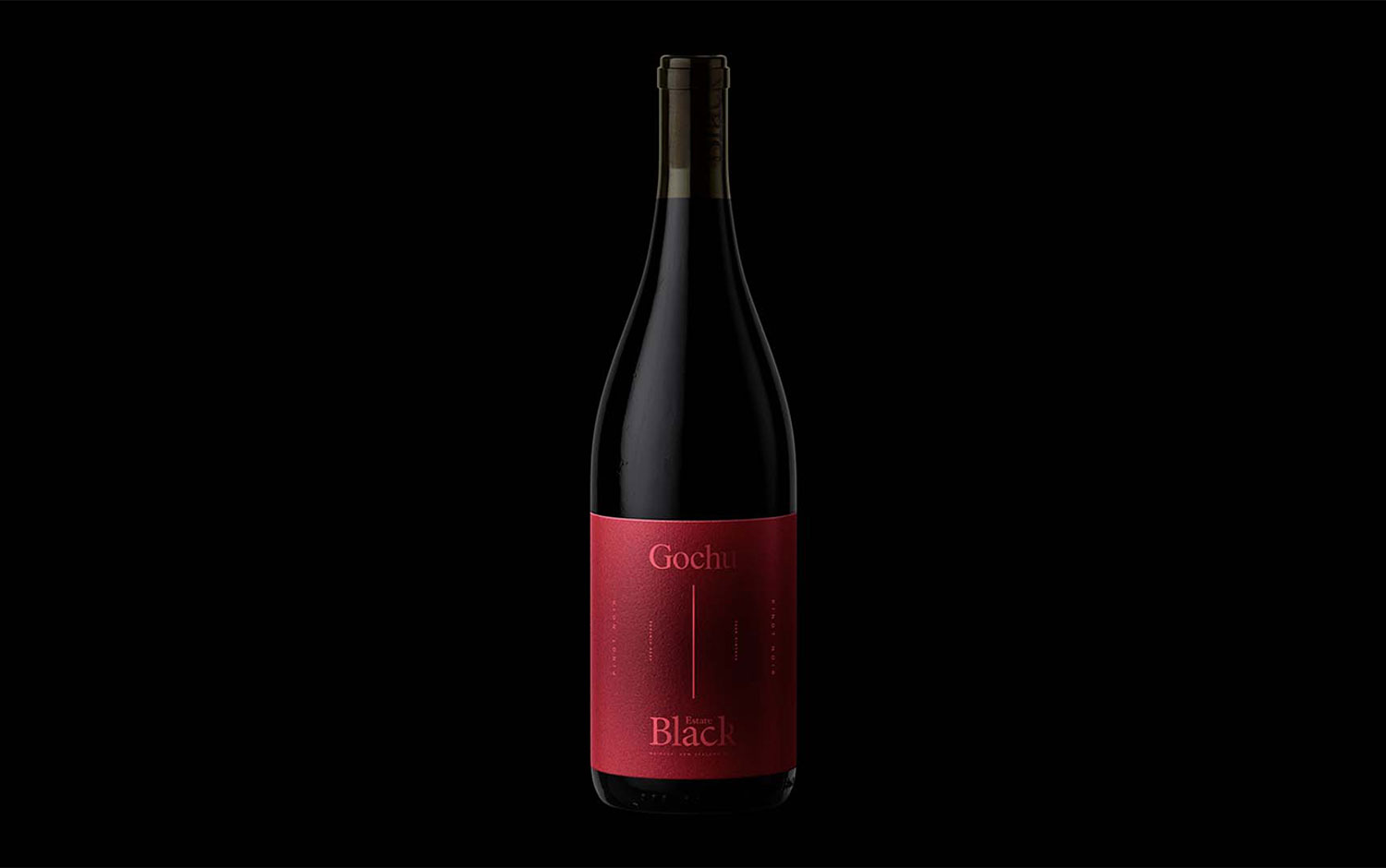
This Monday, we're going binational and far, far away. Or at least for us, these two countries are on the other side of the world. In this feast, each culture complements the other. The project features a collaborative work between a new Korean restaurant, Gochu, and a family-owned, organic winery, Black Estate, located in New Zealand. The creatives behind the visual image of the collaboration are Kevin Rosales and Oliver Simon.
At Black Estate Home Vineyard, selected from rows of young wines block, this wine is bright, youthful, and innovative, and so is its branding design. Ripe wild raspberries, dark, soft like cured coppa, savory, spice, those are some words that describe the bottle's interior. Bottled under cork, the label of this collaborative wine has a minimalist style, and its predominant characteristic is verticality. Kevin and Oliver came up with a super sophisticated yet simple typographic design, where the only graphic element is one thin stroked vertical line. This component bridges the protagonists of the collaboration, Gochu restaurant and Black Estate winery. Designers also played with symmetry and reflections to visually balance the label's composition. One of 2021's trends we've seen all year long is color gradients. The most common effect it has is to give a funky style and being disruptively eye-catchy. However, creatives adapted this resource into an elegant and mysterious feature in their design, giving the label more depth. A raspberry monochromatic color palette is the most peculiar feature of this design with a darker core.
We're looking forward to having a glass of Gochu x Black Estate's wine and taste all the fruitness its design reflects :)
Creator: Kevin Rosales & Oliver Simon