Lafayette American, Scorpion Rose Studio
N/AApril 24, 2024
Mindsparkle Mag


A brand for modern parents: Lafayette American's Scorpion Rose Studio rebrands beloved B2B brand, GoldBug, into a B2C brand. Taking a primarily B2B brand and evolving it into a consumer facing brand is no small feat. Even more so when the company has four different brand logos across their business.
Thats where GoldBug, a woman-owned company and distributor of infant and childrens general and travel accessories, found itself when it was ready to grow into a B2C brand for sale at retailers like Target and Walmart.
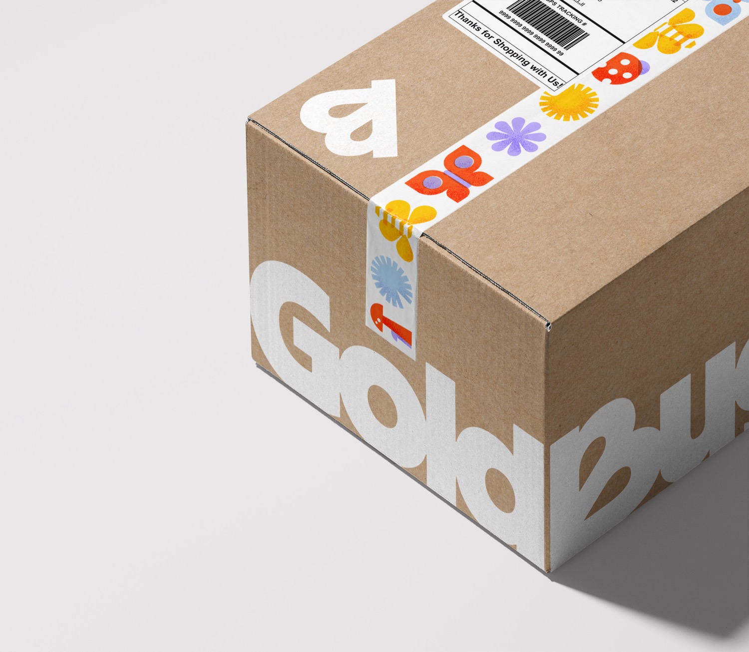
Goldbug partnered with Scorpion Rose Studio (part of Lafayette American) to consolidate its various brands (GO by Goldbug, TravelBug, On the Goldbug®, and Goldbug) into a cohesive, direct-to-consumer identity which was finalized in 2023 and is rolling out this spring.
The business landscape has changed so much since we started in 1968, and were constantly looking to evolve. said Katherine Gold, Owner and CEO of GoldBug. We felt confident it was time to align behind one solid brand that would resonate with both our partners and our consumers.
The process started with basing the brand strategy on the core of what GoldBug offers parents - innovative products that simplify and embrace life's big and little moments. The brand strategy aims to reframe the chaos of parenting as a collection of authentic memories that contribute to a journey of growth.
Scorpion Rose Studio (SRS) landed on Everyday Adventure as the foundational territory for the new brand. The ultimate goal is to shift the brand positioning from travel (a category still in decline from the pandemic) to everyday and on-the-go. The new tagline, we don't just go, we grow, reinforces the brand's mission to support children and parents on their journey of growth and discovery.
From print and packaging to digital applications, every touchpoint reflects the brand's new strategy, creating a cohesive brand experience as both a B2B and B2C brand.
Drawing inspiration from the notion of growth and adventure, it was important that SRS crafted a brand identity that would resonate with modern parents. The logo, typography, and color palette were carefully curated to reflect the brand's commitment to quality and reliability, while exuding a sense of optimism and playfulness. The new logo was designed to pay homage to the previous Goldbug logo which featured a butterfly, as a way to carry the brands legacy into this new chapter. Illustrations featuring subtle imperfections and photography highlighting candid, authentic moments, further reinforced the brand's message, capturing the spontaneity and joy of parenthood.