Cameron Maher
N/AJuly 20, 2023
Mindsparkle Mag


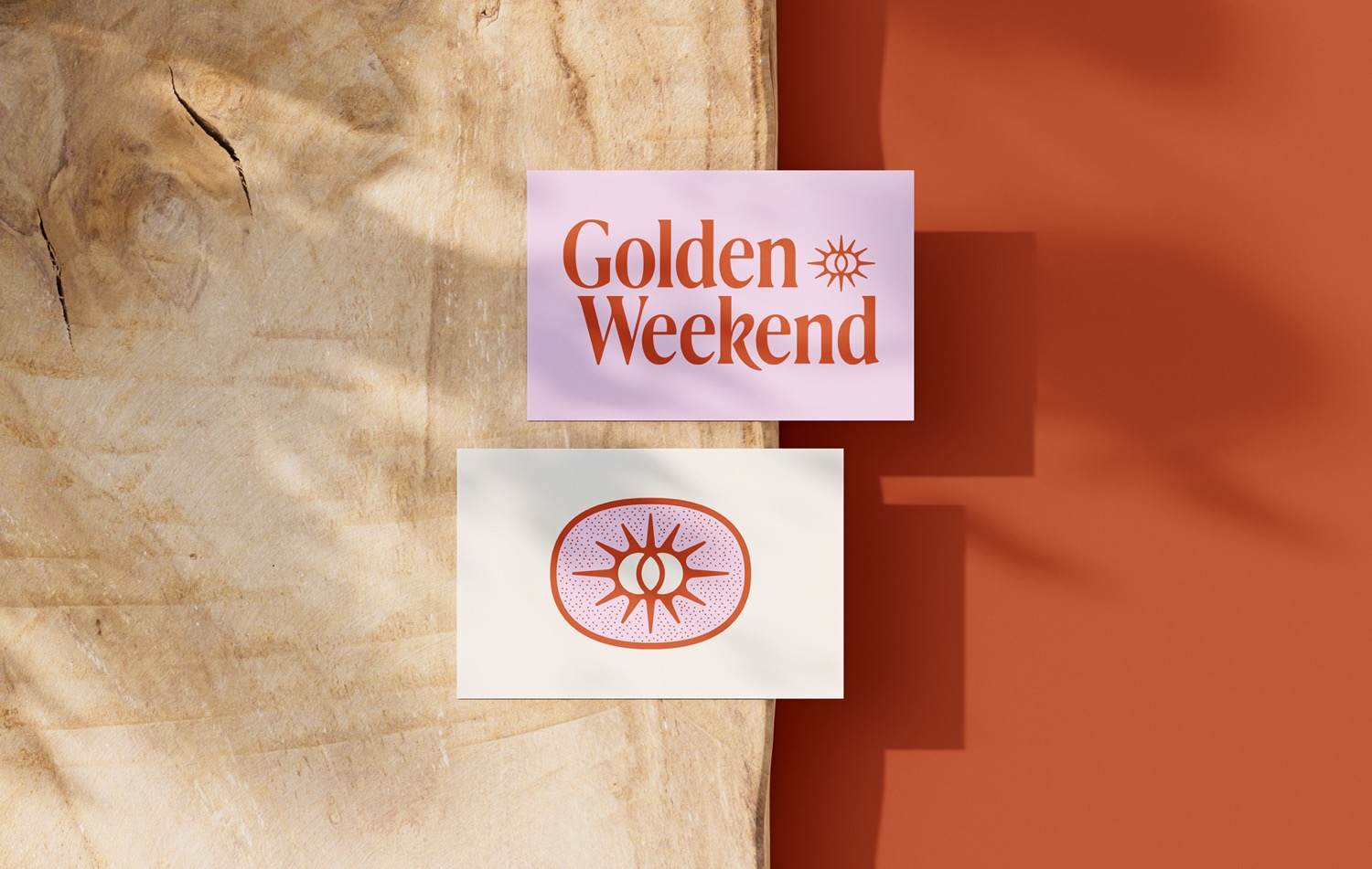
Golden Weekend is an online community for medical professionals. Medical residents are often overlooked and underpowered in the healthcare industry, so when the founder saw a need for a space for people to communicate and feel empowered the idea came into focus to create one himself.
Cameron Maher had the opportunity to work closely with GW's founder to develop a custom wordmark and visual identity that defies the traditional healthcare look in favor of one that radiates serenity. The central goal was for the visuals to not remind you of the healthcare space at all. The vision of the community is to provide an identity outside of the workplace, one of individuality – hence the name, which refers to the "golden" situation when a resident has both Saturday and Sunday off. Initial research led down a path of visual relaxation: typography that felt like it was taking a big morning stretch and colors that felt familiar and worn-in. A simple combination of the familiar and the unique wrapped into one seamless identity. The final wordmark, which serves as a focal point in the brand, is a customized variation of the lovely Ivy Presto. Cameron notes that he broke the one rule that you learn in your early stages of your career - don't stretch your type. In this case, it felt like a good opportunity to bend the rules to create something unique. He wanted to evoke a feeling of type from yesteryear. Other slight cosmetic tweaks were made to the serifs and most notably, the 'k' to achieve a relaxed and softer look. The inspiration for the logo mark was rather on the nose. Capturing the idea of the 'Golden Weekend' into a double sun mark felt like low-hanging fruit, but sometimes what feels right, is right.
Creator: Cameron Maher