Outline
N/AApril 22, 2024
Mindsparkle Mag


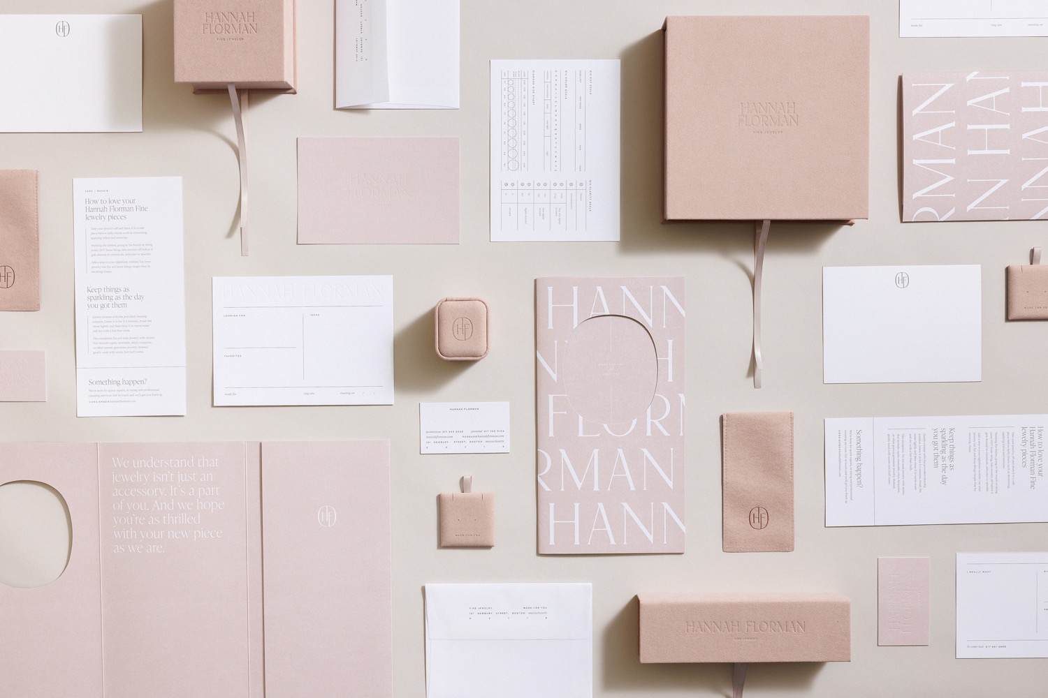
For Hannah Florman, a custom jewelry designer in Boston, Massachusetts, the most subtle details speak the loudest. For the brands custom wordmark, Outline designed a fully custom display serif, blending sharp points with softened counters and rounded connection points that feel distinctively refined. Paired with its gentle curves, the wordmarks impactful scale speaks to the precision and artistry of creating custom pieces. Enclosed within a cushion shape, an accompanying brand mark gestures to the heart of Hannahs approach: as much about connection as it is about craftsmanship.
In her Boston studio, known as The Brownstone, Hannahs custom jewelry process begins by understanding what inspires her client. From there, she embarks with them on a journey of discovery and education. In bringing the brand to life, Outline partnered with Hannah to infuse brand elements into every stage of this intimate experience from clients first-visit forms to The Brownstones subtle signage.
With details only discovered after spending time with Hannah in the space, Outline ensured that The Brownstone and its touchpoints represented the full expression of the brand: always highly custom, yet understated nature.
A vision for a holistic suite of print materials and packaging quickly emerged, reflecting the thoughtfulness the designer applies to her custom jewels and customer experiences. When it came to packaging, Outline knew the final piece of the puzzle would need to be as subtly refined as the rest of Hannahs bespoke process. For clients finished pieces, they created a custom-dyed suede jewelry box, adorned with a debossed version of the wordmark. Delicate ribbon ties and hidden interior messages are found when recipients look closely, elevating the keepsake even further.
Creator: Outline