OlssønBarbieri
N/AMarch 21, 2017
Mindsparkle Mag


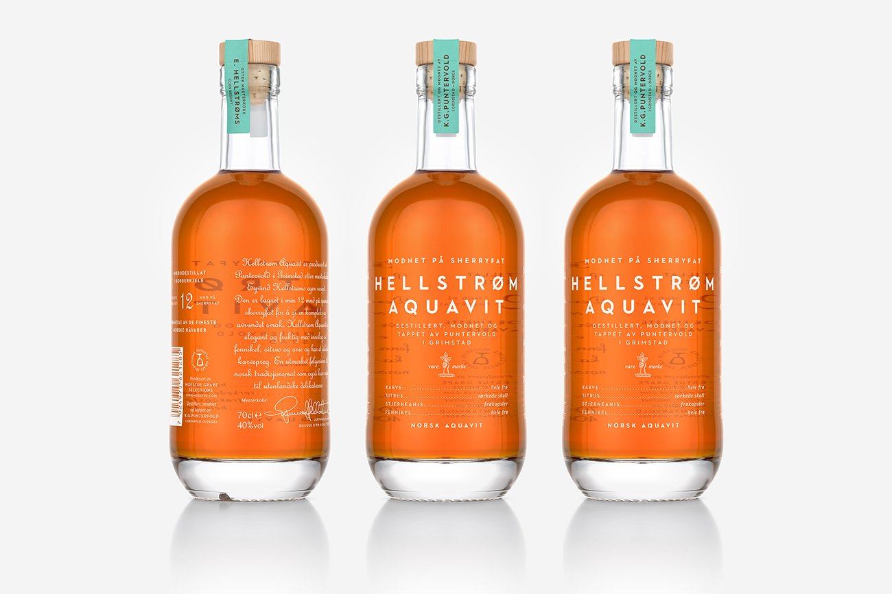
"Enkelt og Perfekt"
(simple and perfect) is Hellstrøm´s mantra and
regarded it as the essential ingredient for the integrity of the brand. Authoritative, masculine, accessible and heritage were additional ingredients to shape the product and take decisions in terms of materials, bottle shape, execution, tone of voice and colors. OlssønBarbieri reduced the choice of materials to the essential and selected only natural and honest ones; the silkscreened glass bottle, the cork closure with an untreated wood top and an uncoated paper seal. OlssønBarbieri wanted the bottle to communicate a premium and masculine look without compromising its functionality the bottle needed to be comfortable to use around the table and allow serving with one hand. The bottle shape is new in the category. To silkscreen the bottle was a choice to
"reduce"
and to aspire to an iconic and sharp brand personality, together with allowing the product to transmit a feeling of heritage and trustworthiness. The ingredients on the front and the measuring scale on the side are both homages to the chef world and the color of the aquavit is paired with the complementary color in the seal.
Creator: OlssønBarbieri