Han Gao
N/ASeptember 20, 2022
Mindsparkle Mag


Originally Helvetica, known as Neue Haas Grotesk, was designed to replace and update the old-school Standard typeface in the occidental world. With perfect timing, as Swiss they are, Haas foundry took its opportunity to increase its sales within the Grotesk market. Beyond being successful among Swiss designers in the 60s, the type was renamed Helvetica for marketing reasons. Obviously. Though it translates from Latin as Switzerland's demonym. Because of its steep widespread in the Western hemisphere, Helvetica has made it into the International System by being one of the most used fonts worldwide despite not being original and its boredom.
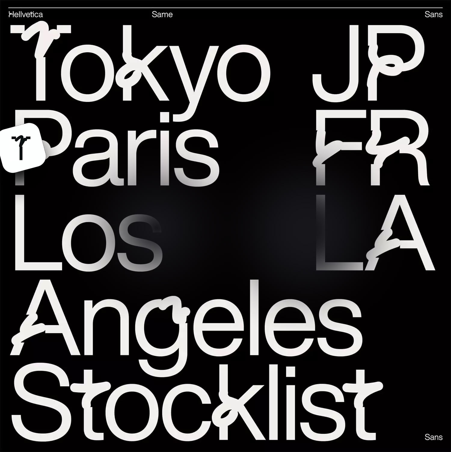
Exclusively designed for Same Paper, the new “Hellvetica” was meant to disrupt. Whereas Helvetica is unseen, its bolder version is the teenage sister. Designers chose several characters to be intervened. Hellvetica features some sharp cuts from its original font and adopts some doodly, handwritten strokes to complete the letter's shape.
Moreover, by navigating the darkest side of the internet, just googling similar Hellvetica variations, we found another living hell typeface(? Well, first, let's define or refresh what's kerning. Kerning refers to the way spacing between two specific characters is adjusted. The idea is to give a better-looking result by reducing the spacing between characters that fit together nicely, such as A and V, and increasing the spacing between characters that don't. So, the second variation of Hellvetica plays with our feelings and eyes by separating characters indiscriminately *insert the angriest emoji ever existed*
PinHellvetica on display converted into a demon ;)
Hellvetica presents two variations. The version for Same Paper's display is bolder than the one Han Gao's team showcases in its portfolio to catch people's attention. We wonder what the briefing Same Paper gave creatives might have looked like. We imagine it could have been like this: "Hey guys, would you mind disrupting the very well-known and expected?" Nevertheless, whatever the assignment was, this Helvetica variation brings chaos to our world and allows us to question the status quo.
Let us know on our social media how you feel about this variation of a classic typeface ;)
Creator: Han Gao