Luminous Design
N/AJune 21, 2023
Mindsparkle Mag


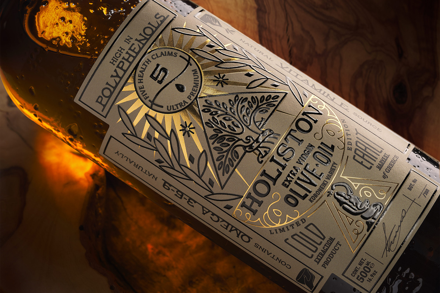
Whole to partsHaving as a reference the idea of holism, Luminous Design developed the brand name Holiston, a comprehensive approach that reflects the concept offered by the brand's holistic products, that is, health-protective foods alongside superior taste. For the logo, they designed a female figure holding a container, a way to express the archetypal process of harvesting fruits from the earth, showing the superior quality and organic nature of the brands products.
Designing the label, Luminous Design chose to narrate an old story through a modern approach, with references to craftsmanship and handmade processes. The bottle with its characteristic texture, refers to the organic nature of the product. The label introduces a new language of communication, with the prioritization of information playing a crucial role, as the claims they created are the dominant design element. The result reflects the beneficial nature of the product, by combining its premium character with its high nutritional value, to create a new iconic way of approaching olive oil.
Creator: Luminous Design