Shorthand
N/ASeptember 06, 2016
Mindsparkle Mag


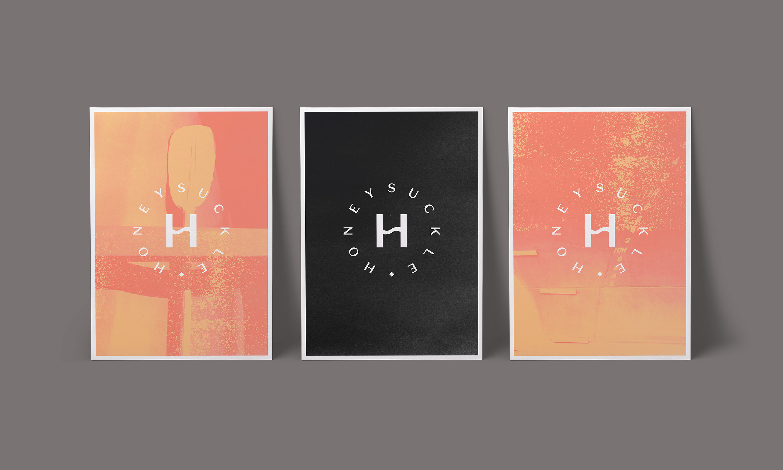
Honeysuckle is a vibrant waterfront precinct in Newcastle, NSW. Born from an industrial landscape of railway workshops, wool stores, cargo sheds and warehouses, the precinct is an important chapter in the city’s rejuvenation. Boasting the best views of Newcastle’s bustling working harbour, Honeysuckle is a unique place to live, work and play. The studio Shorthand from Newcastle Australia were tasked in creating a new brand identity for Honeysuckle that expressed the history and vibrancy of the precinct, while maintaining a sense of sophistication. At the heart of the refreshed brand identity is a custom monograph – with the S turned on its side to create a stylised wave. The supporting system is influenced by the juxtaposition of the precinct's clean, modern architecture and the rawness and heritage of the working harbour. The stylish black and white colour palette is contrasted by a bright hit of salmon – inspired by the honeysuckle flower. A subtle rust texture is also used throughout the identity as a reference to the precinct's industrial roots and the hulls of passing cargo ships.
Creator: Shorthand