Martina Legarreta
N/AOctober 05, 2020
Mindsparkle Mag


This is our third series from our illustration series hosted on Mindsparkle Mag featuring the latest illustration trends, including 3D illustrations, UX illustrations, collage, and much more.
For this selection, we wanted to showcase illustration and typography, and how both disciplines compliment each other, achieving incredibly original solutions for one same alphabet. For this particular feature, many of the works we selected were a result of the "36 Days of Type" Challenge - a project that invites designers, illustrators and graphic artists to express their particular interpretation of the letters and numbers of the Latin Alphabet.
A yearly open call exploring the creative boundaries of letterforms, where participants are challenged to design a letter or number each day for 36 consecutive days, as a global and simultaneous act showing the outcome of the ability to represent the same symbols from thousands different perspectives.
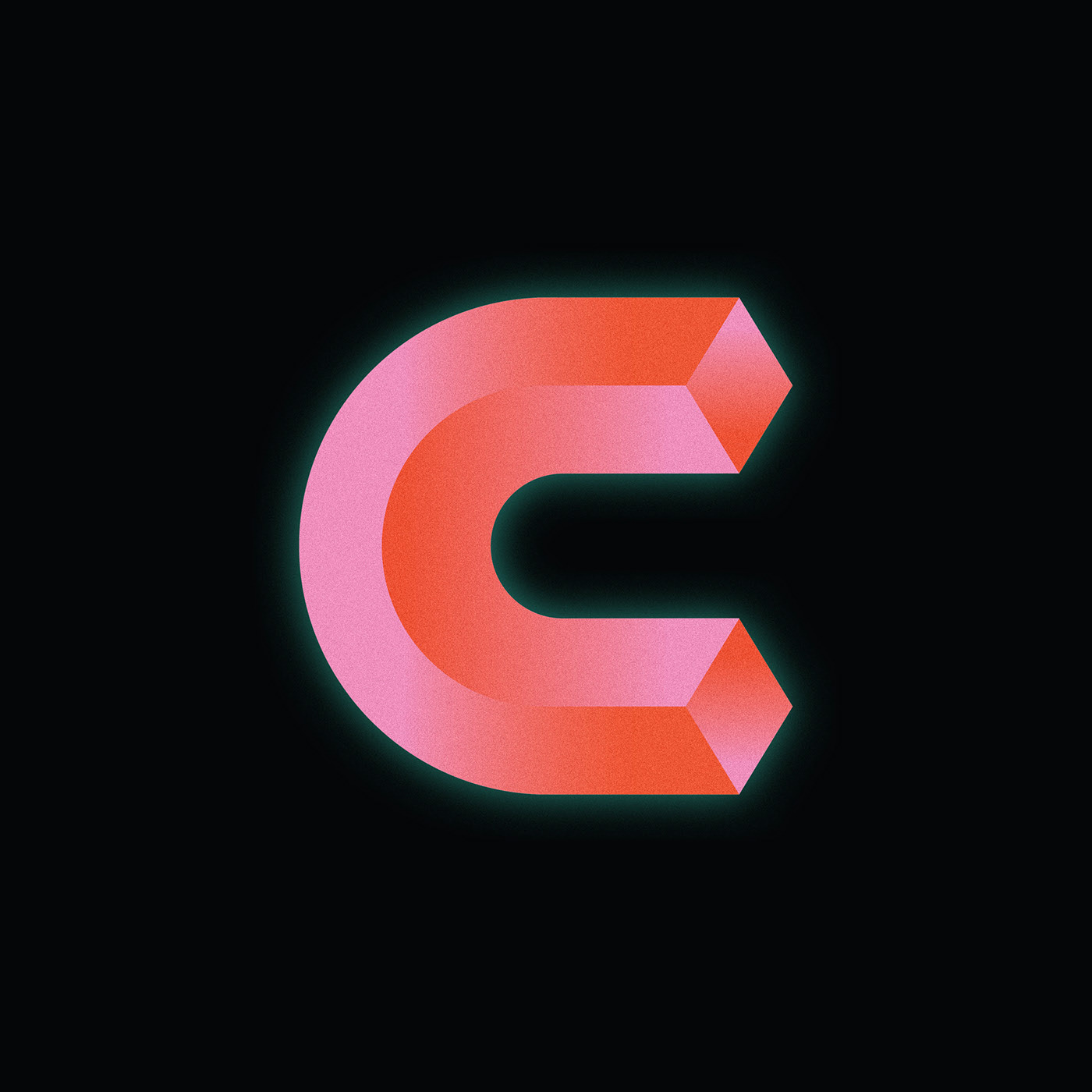
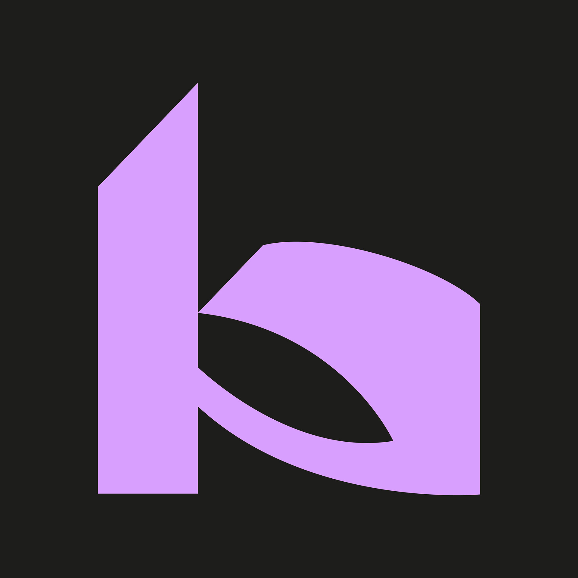
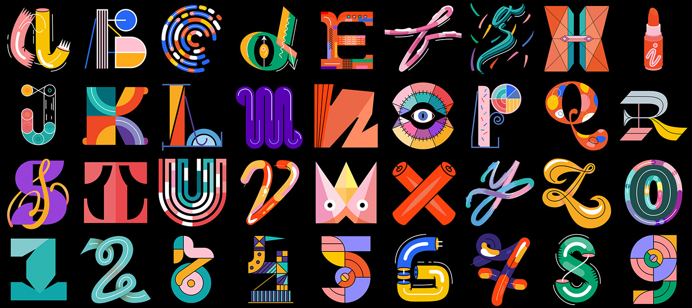
36 days of type 07 by Jasmina Zornic
36 days of type 07 by Jasmina Zornic
Jasmina Zornic played with a vivid color palette (6 colors) and some 2d/3d simple vector shapes. Jasmina is an Art Director & Designer who specifies in typography, print, vectors, colors & textures.
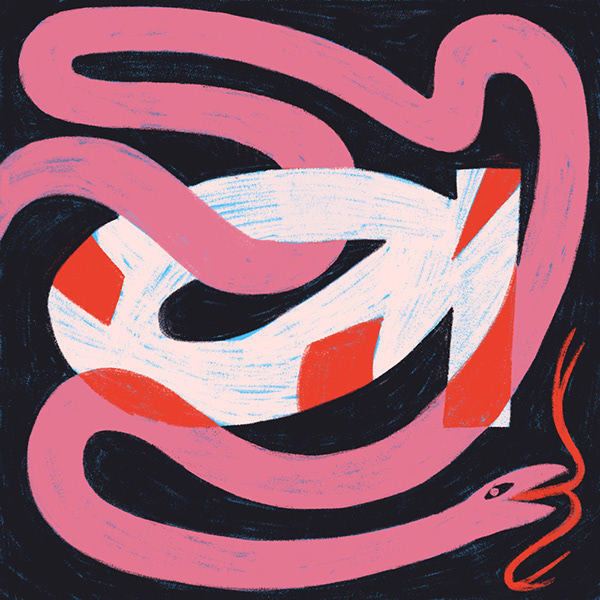
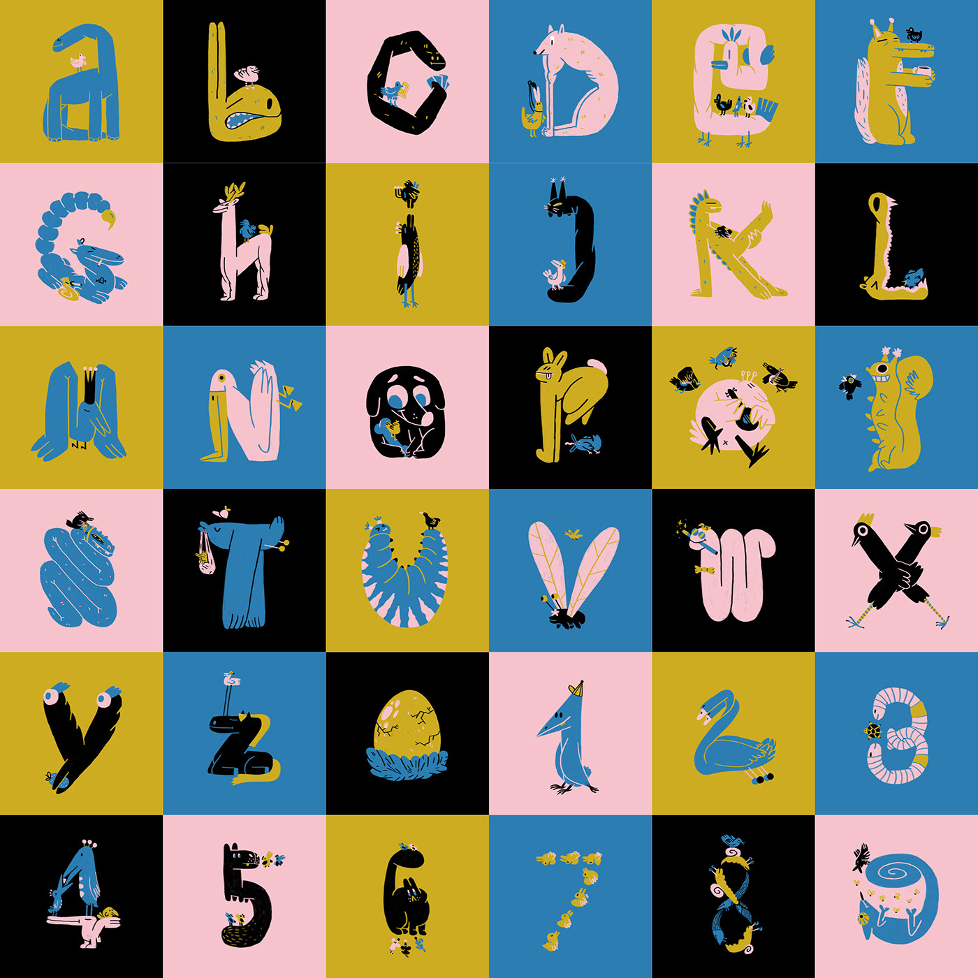
36 days of type by Magdalena Marcho
36 days of type by Magdalena Marcho
For the same challenge, Magdalena Marchocka went for a more illustrative and hand drawn aesthetics. For her, tt was not meant to be a cohesive typeface, more an exercise in form and a fun drawing practice.
36 days of type by Adele Vaskelyte
36 days of type by Adele Vaskelyte
Adele Vaskelyte is a graphic designer based in Worcester, UK. She helps people to tell their stories with clear design specializing in branding and print design with experience in UI. She also participated in this challenge, and her outcome was a really vibrant and vintage look typography.
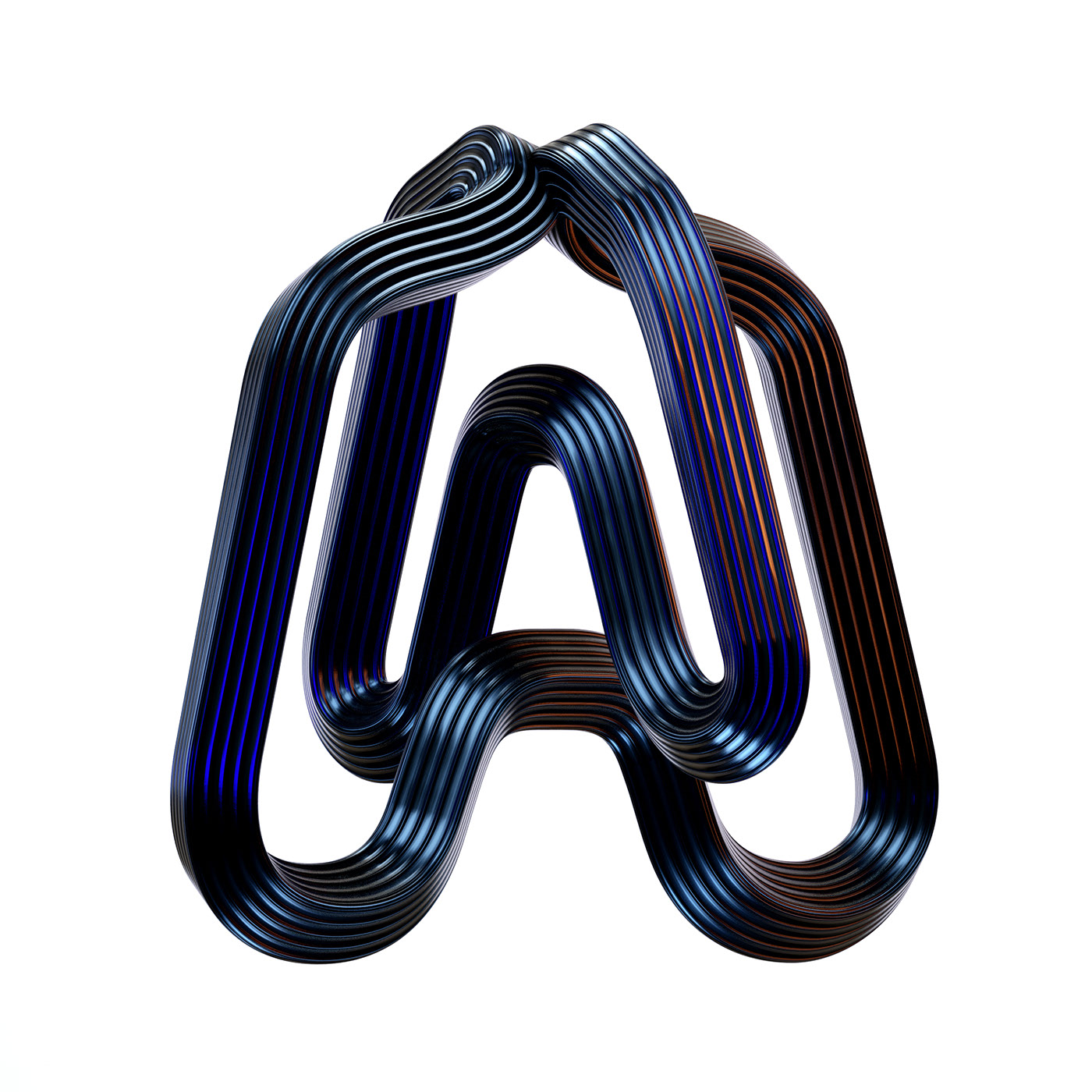
36 days of type by BÜRO UFHO
36 days of type by BÜRO UFHO
BÜRO UFHO created 3D Type sculptures completed for 36 Days of Type, a project that invites designers, illustrators and graphic artists to give their unique view on letters and numbers for 36 days of nonstop creativity.
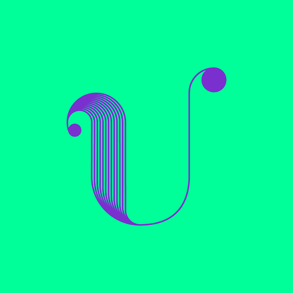
36 Days Of Type byKatalina Maievska
36 Days Of Type byKatalina Maievska
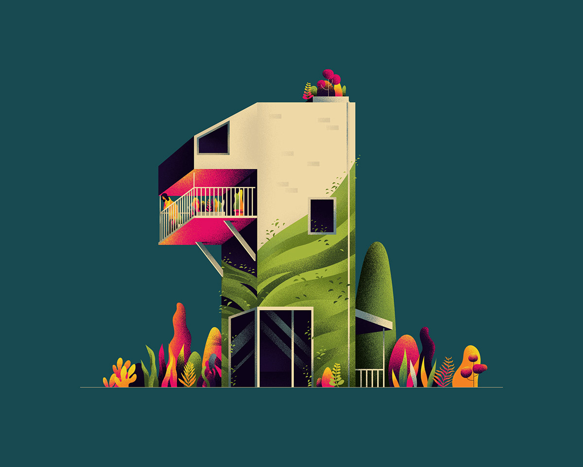
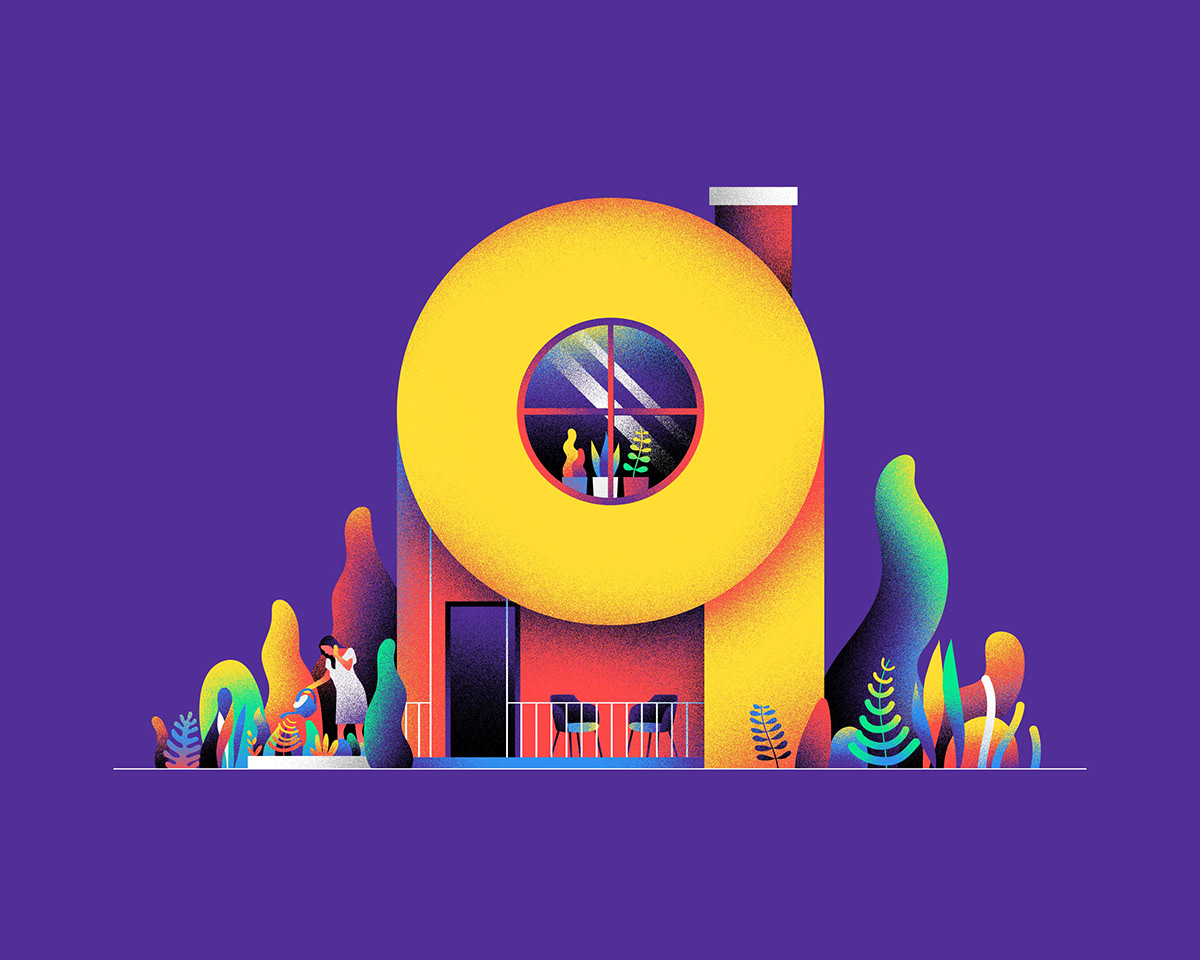
NUMERICAL - ARCHITECTURE by Muhammed Sajid
NUMERICAL - ARCHITECTURE by Muhammed Sajid
Muhammed Sajid created an architecture based number alphabet for 36 days of type.
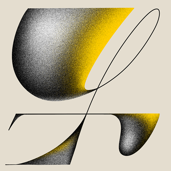
36 Days of Type by Áron Farsang
36 Days of Type by Áron Farsang
Áron Farsang's style was a bit more retro - vintage style, using textures as grain, and rounder corners on the typography, and sticking to a less vibrant color palette.
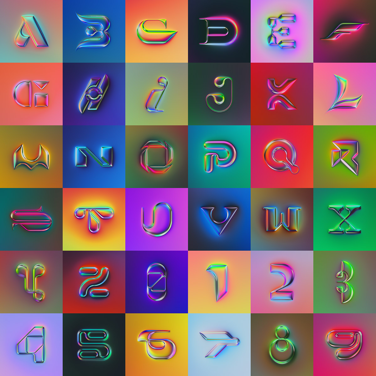
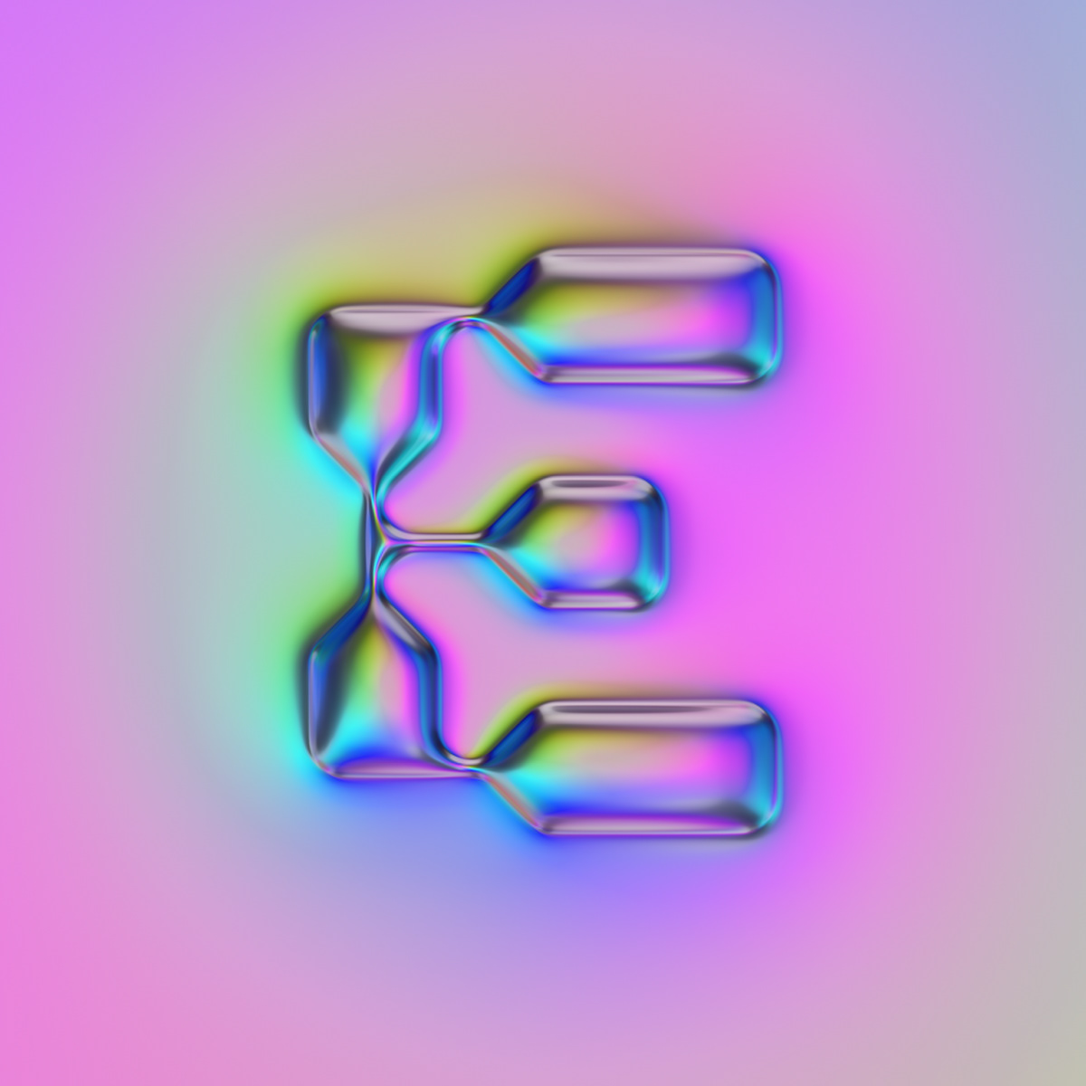
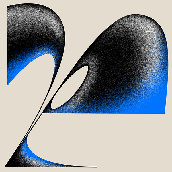
36 Days of Type by Martin Naumann
36 Days of Type by Martin Naumann
For this edition of the 36DOT challenge Martin decided to go for a more powerful expression than last time. Like the collection of 2019, this series is also inspired by the 80s chrome style. But this time, he wanted to create a series with really different looking pieces in a uniform look. To keep it diversified, he combined abstract letter types with a different monochrome look for each piece. The letter shapes had to stand out from the background just because of its reflection.
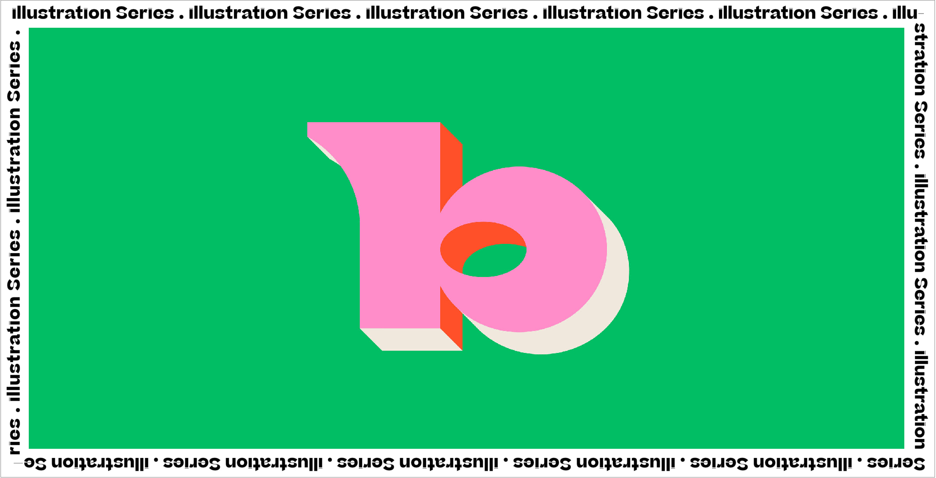
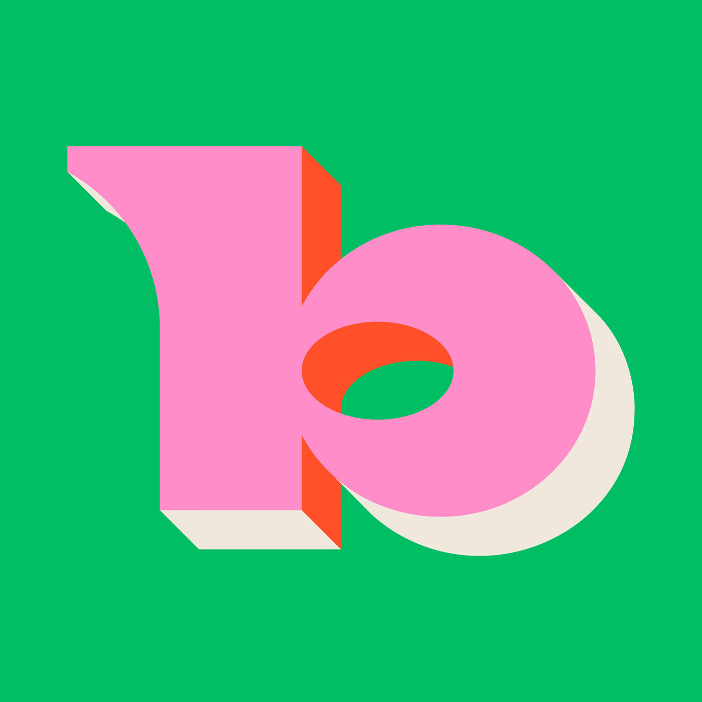
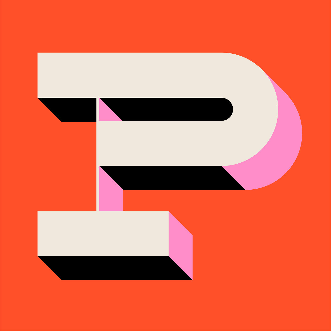
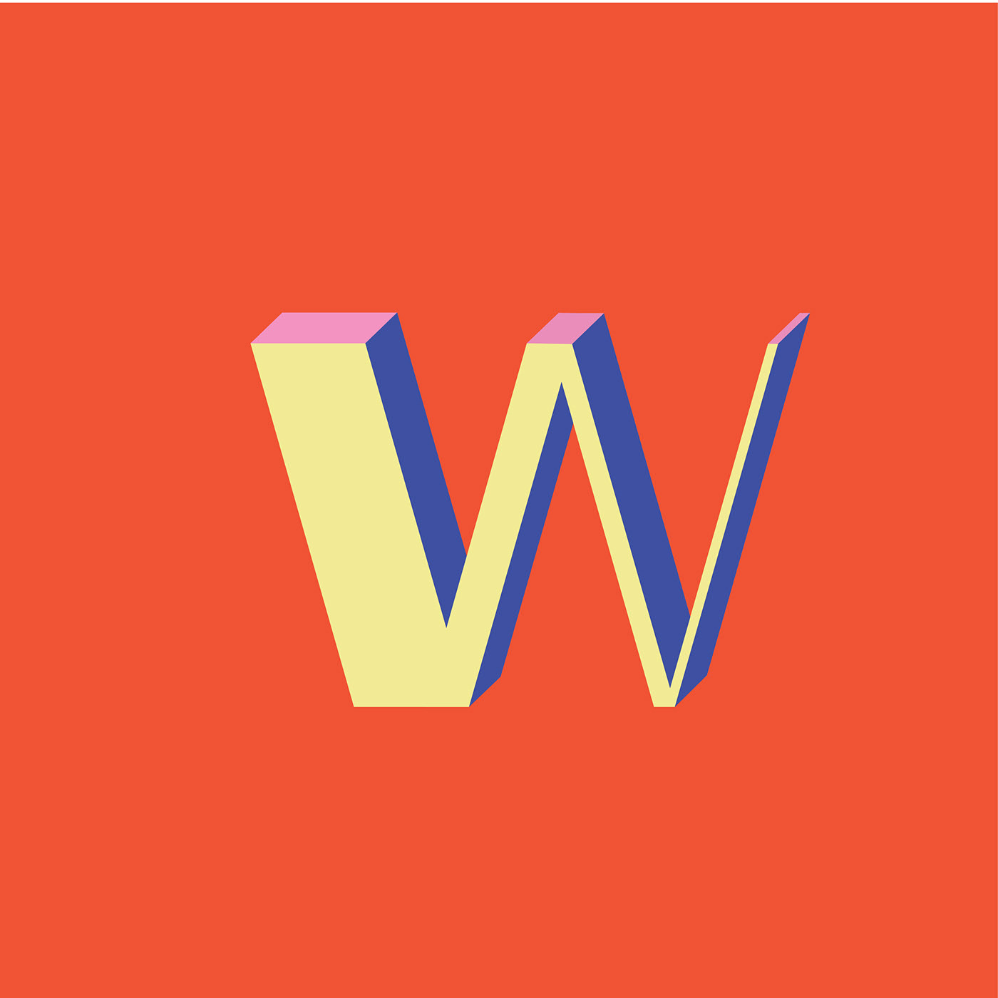
36 Days of Type by Marcos Vinícius Machado de Oliveira
36 Days of Type by Marcos Vinícius Machado de Oliveira
Marcos Vinícius Machado de Oliveira created a unique typography, combining a primary color palette to a high-contrast typeface, where the designer plays with perspective and shapes, creating a beautiful outcome.
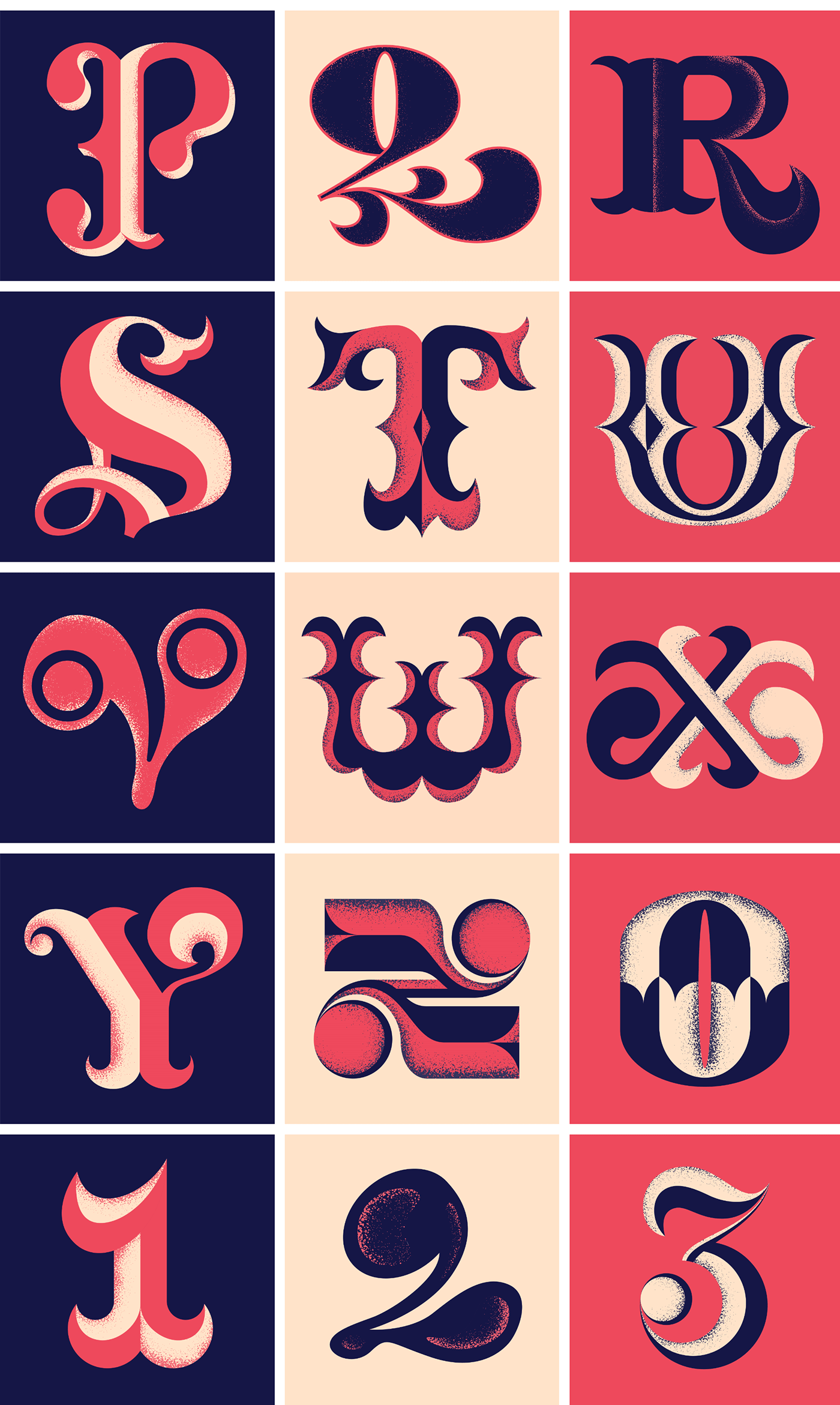
36 Days of Type by Daniel Castrillon
36 Days of Type by Daniel Castrillon
This series is an exploration of the plasticity of the strokes and volumes that make up each character, with fluid gestures typical of calligraphy and exaggerated contrasts.
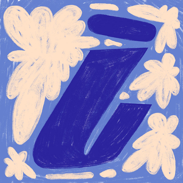
36 Days of Type by Zsófia Bányai
36 Days of Type by Zsófia Bányai
Zsófia Bányai created each letter based on a word or phrase starting with the letter of the day, for example A in her alphabet comes from "adopt", B from "bunny", C from "casino" and so on.
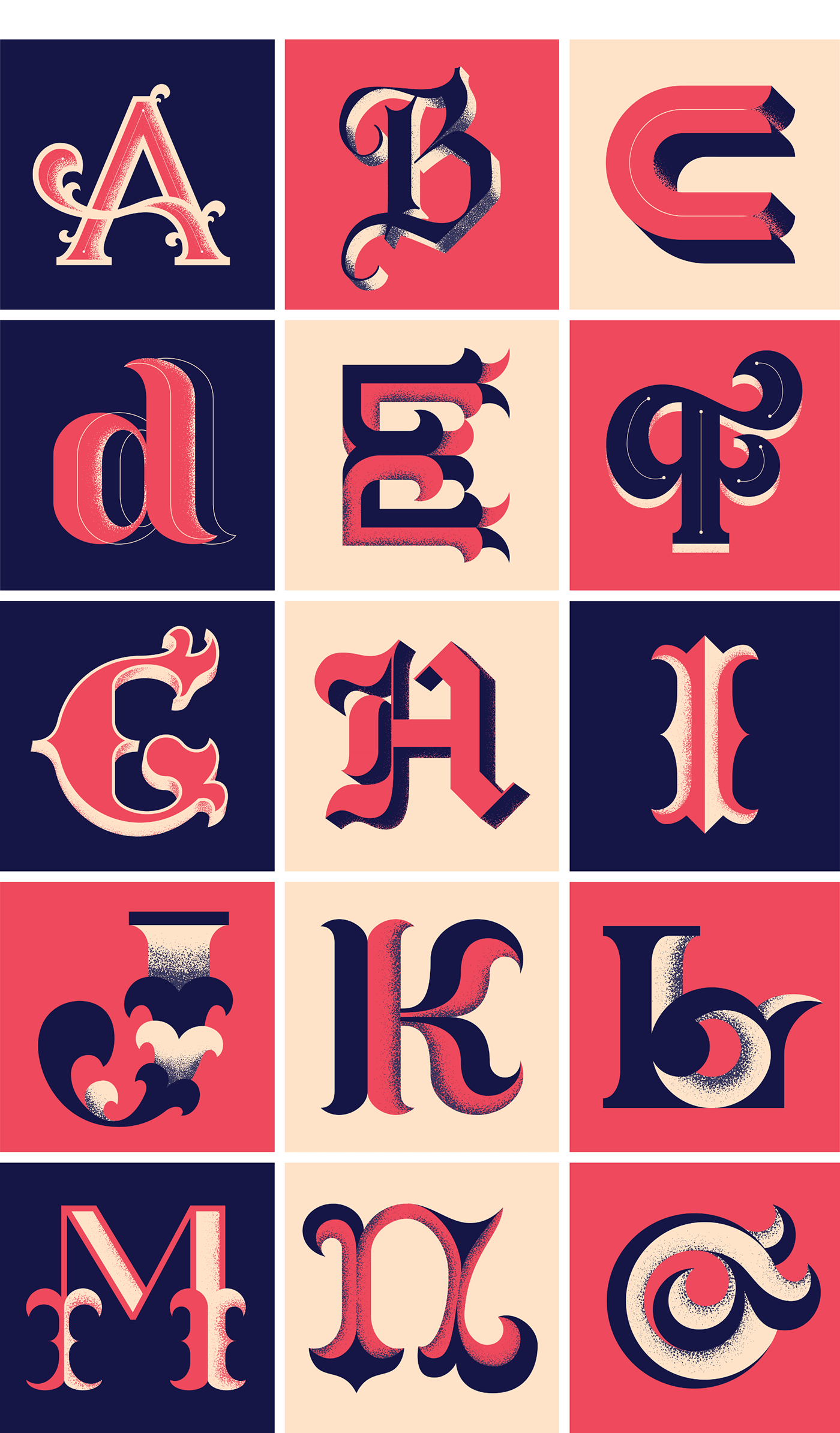
36 Days of Type by Katarzyna Szykowna
Katarzyna Szykowna's alphabet plays with a vibrant color palette and digital assets, giving the whole typography a "robot" and playful look. The contrast with black color at the back makes the typeface stand out even more.
We hope you've enjoyed these illustration series and we'll keep on working to bring the latest trends on illustration and design to our community of makers ;)
Creator: Martina Legarreta