Ensemble
N/AAugust 28, 2022
Mindsparkle Mag


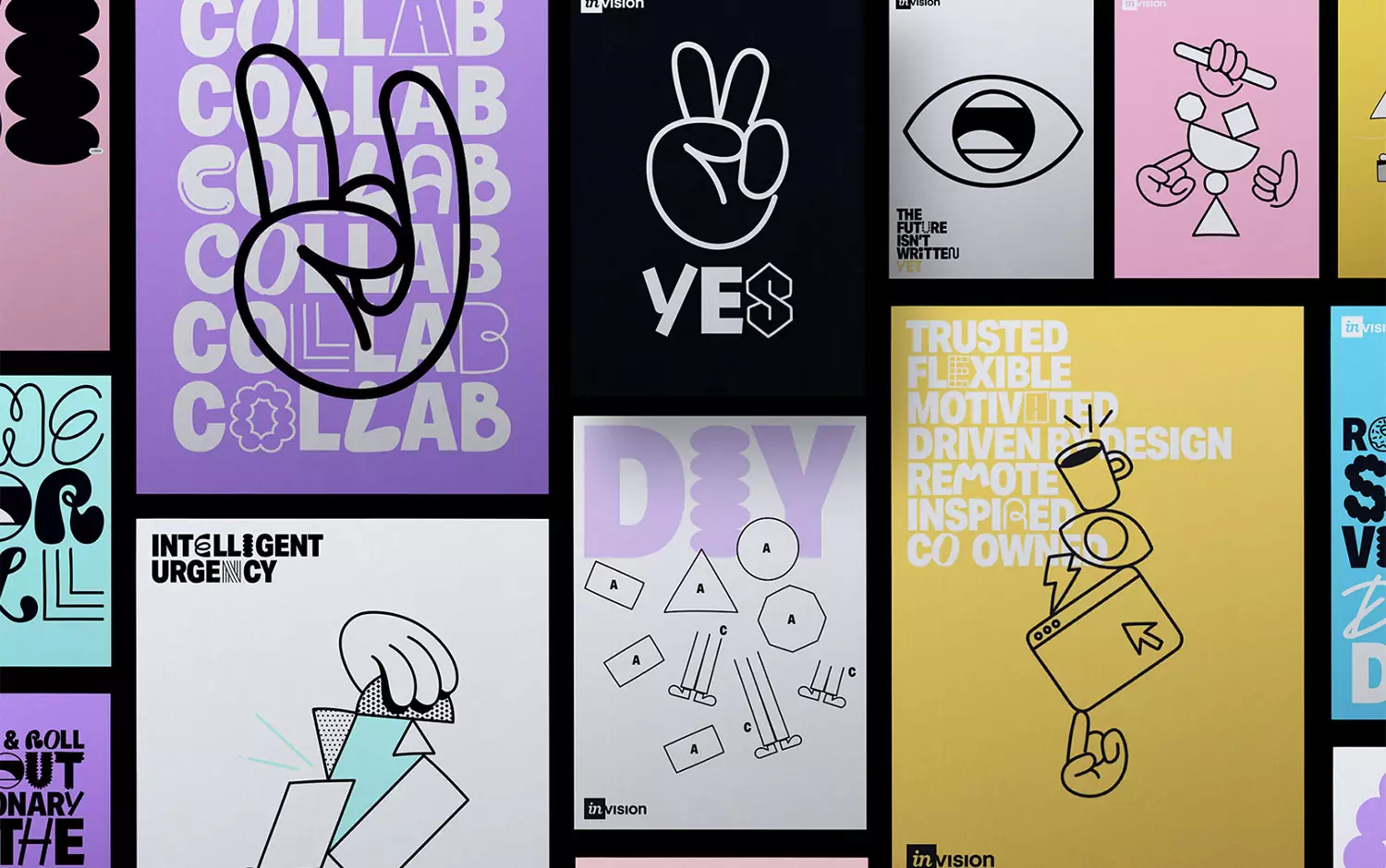
Ensemble worked with InVision to develop a visual language for their internal ‘People’ identity to reflect their refreshed positioning better and more closely align their different activity streams.
The idea was simple – the team at InVision should create it. So they built a framework that gives the people of InVision the ability to contribute and shape the look and feel of the identity through a process of inclusive collaboration (through the use of their core product, Freehand) and then curated it accordingly.
As a starter, Ensemble creative team developed a suite of typographic alternatives to their core type family (Aktiv) across three styles (Black, Line, and Symbol) with the intention this would be an ever-extending suite as the team contributed, giving the required personality and ownability.
Additionally, they devised a simple suite of hand-drawn illustrative elements across a range of themes: shapes, tech, expressions, and hands that the team could then use in a DIY approach to help convey any message or theme. Never precious – always part of an expanding set and ongoing conversation.
Creator: Ensemble