Merve Gulay Oztaskin
N/AJune 22, 2023
Mindsparkle Mag


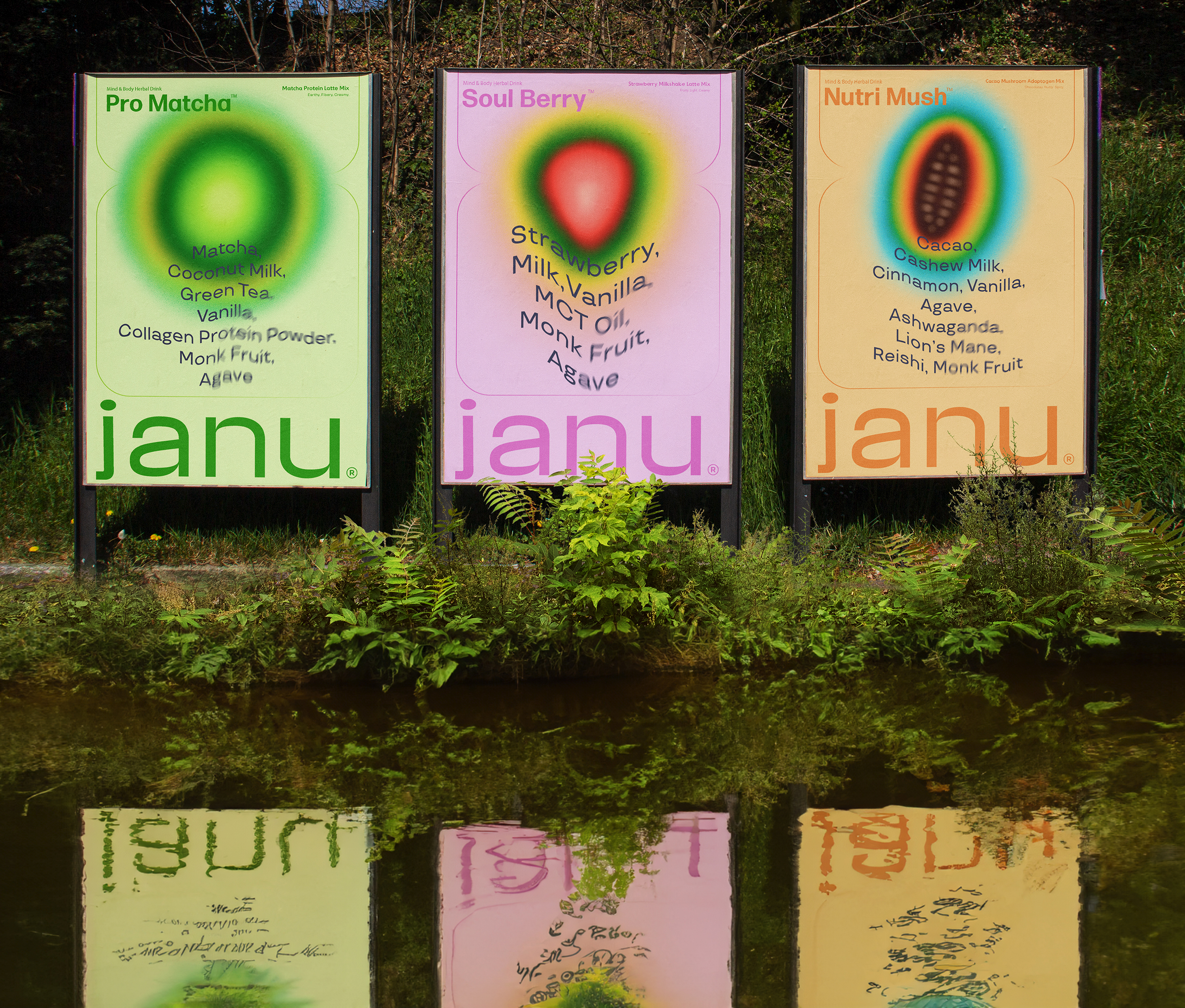
Nourish your mind, body and soul with earth-powered Janu herbal drinks.Janu believes in the utmost power of nature-driven ingredients for physical and mental well-being. The brand offers powdered-drinks rooted from superfood and adaptogenic mushrooms. Janu is on a mission to help facilitate all individuals incorporate health & balance routines into their daily lives. JUST DESIGN FX designed a branding and sustainable packaging system for Janus product line that consists of packed dissolvable powdered drinks and Nespresso capsules. JUST DESIGN FX started out their branding journey by finding the right names for the product line.
The main brand name Janu has meanings of soul, life force, birth place. Then came up with the sub-product names for the three different powdered flavors; Soulberry, Pro Matcha and Nutri Mush.The creative agency created soulful illustrations that resemble the three key ingredients; Matcha, Cacao and Strawberry that take place in the powdered-drinks. The main focus was to design all product packaging with a minimal approach to reflect the purity of the brand ingredients alongside making the illustrations the center of attention. The color palette of each packaging signify the flavor taste notes of each drink.Coming up with the brand tagline more than plant alongside our green J logomark illustration, JUST DESIGN portrayed the essence of the brand rooting from plant-driven drinks and carried over the message of the powerful effects of plants on our lives when incorporated in the right way.
Creator: Merve Gulay Oztaskin