Studio Otwarte
N/AJanuary 19, 2018
Mindsparkle Mag


The visual identity of the 27th edition of the Jewish Culture Festival was designed by Studio Otwarte, taking inspiration from the multilayeredness, complexity and dynamism of Jerusalem.
'Yerushalayim, Jerusalem, Urusalima, Al-Quds, Aelia Capitolina.
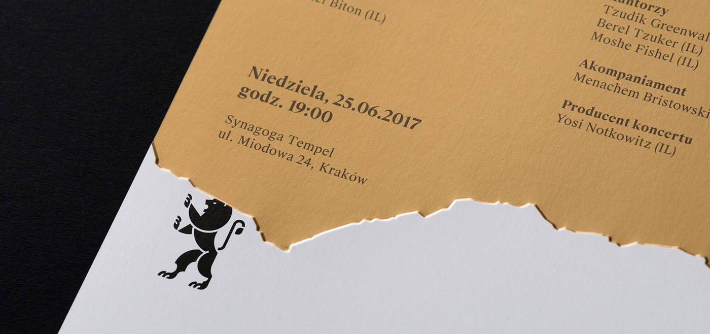
A place so important for Jewish history and culture, that Lion of Judah, taken directly from its municipal emblem, was being used in the Jewish Culture Festival's logo since 2013, and the Festival's 27th edition was dedicated entirely to Jerusalem.
Jerusalem is the only place on Earth, where different cultural, historic, religious and social spaces are arranged into so many layers – though not in order to freeze in place, but to mix, overlap, penetrate each other and fight for their rightful place.
Gold, a characteristic colour for JCF, once again found a profound justification: Jerusalem of Gold overlaps and mixes itself with black, white and multitude of textures, reflecting the character of the city. A beautiful, fascinating one but at the same time, demanding and challenging.'
Creator: Studio Otwarte