João Ferreira
N/AJuly 11, 2021
Mindsparkle Mag


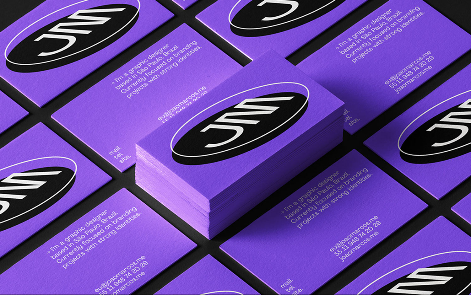
Continuing the line with top10 series: personal branding from a couple of weeks ago, today we are showcasing a new identity from Brazil., miles away from a traditional carioca style. Smiley faces and a vibrant purple shade are the main features of Joao Marcos's identity. Let’s say joy is a well-known Brazilian characteristic.
Unsatisfied with his very own visual identity, Joao decided to create a new one based on his previous image, but with a more modern imprint. A ‘WordArt-like logo’ is the word he uses to describe it. His work is not only defined by an incredible bidimensional simplicity, but with regular shapes, he managed to create 3d animations combining the best of both worlds. What’s interesting about this project is its three-dimensional side featuring stripped tubes that seem to surround you or come along from the viewer’s side. These tubes graphically reflect Joao’s echoes and spreading capacity through design. All in all, this project's abstract message about the designer communicated with an eye-catch visual style and modern, kind-of-weird, but unique imprint.
Creator: João Ferreira