Kinda Ghannoum
N/AApril 25, 2020
Mindsparkle Mag


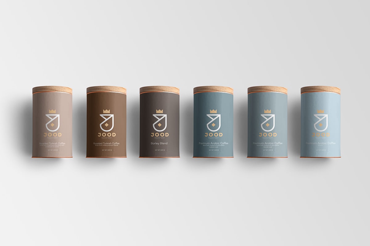
Kinda Ghannoum designed JOOD, which is an Arabic word which means “best” in English, and a Saudi Arabian coffee roastery brand based in Dhahran. The logo concept is the first letter from the word Jood in Arabic (ج) and English(J), leaving the dot of the letter J in Arabic to reflect the Arabic originality, and replacing the dot of the J with a crown which reflect the quality and the legacy of the family business.
Creating the identity meant finding the right balance between the old family business and the new young and fresh look. This duality is reflected in the pastel and fresh colors of the identity and in the sharp pattern which were used in the packages of the coffee beans.
The design of the pattern plays with the sharp shape that we have created the logo from in different forms, combinations, and colors. which were inspired by the Arabic culture as well.
Creator: Kinda Ghannoum