Studio Impulso
N/ASeptember 20, 2021
Mindsparkle Mag


Sometimes we aren't conscious about the life rhythm we're living in, and the super fast-paced culture doesn't help to enjoy the little and beautiful things about life itself. However, we know some jobs encourage people to take it easy, and these people are mindful about what they're doing and enjoying the process. Today, we're showcasing Kaolin's visual identity designed by Studio Impulso.
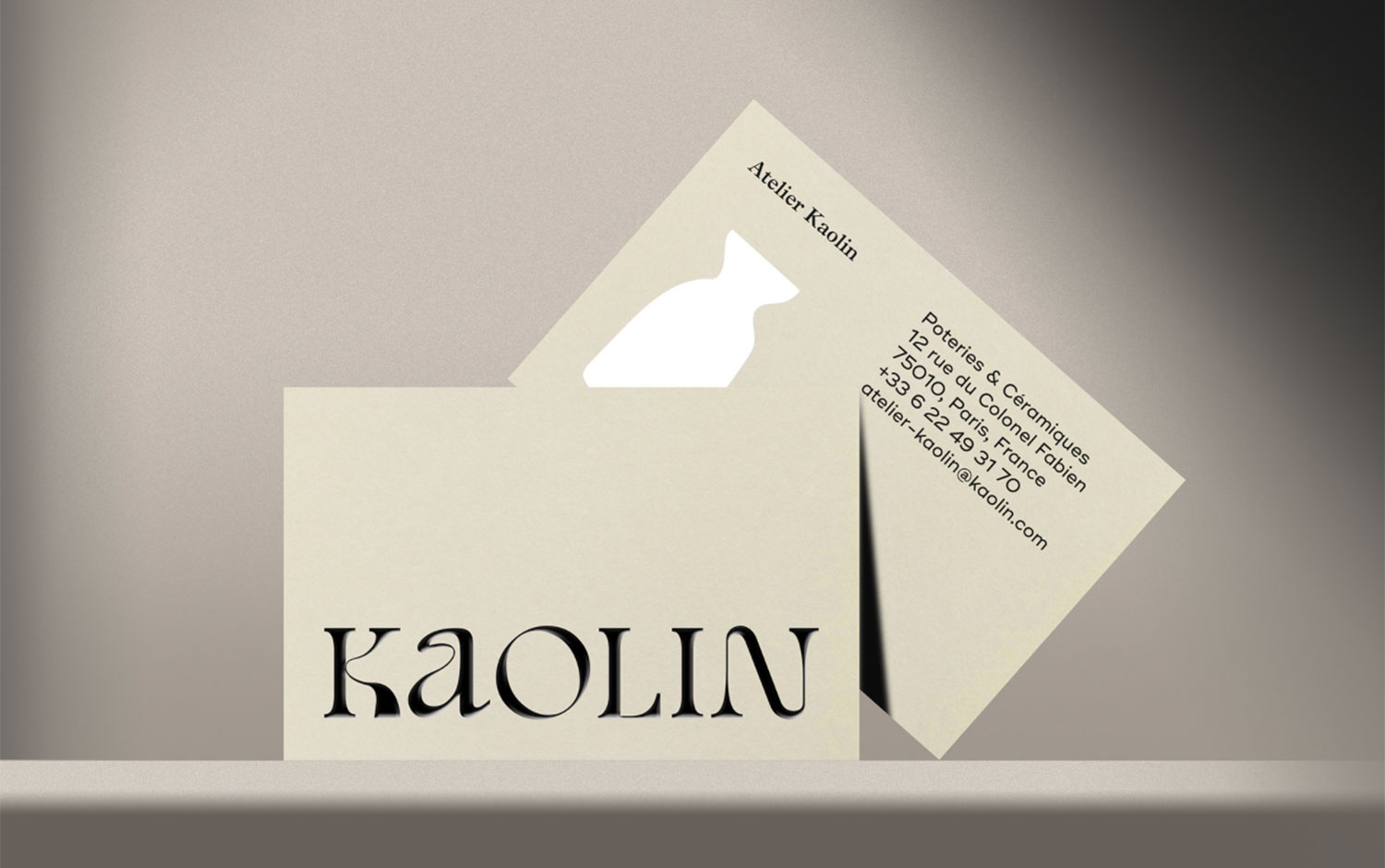
Based in France, Kaolin is an atelier where artisanal pottery comes to life and ceramic manufacturing workshop where its artisans create objects with tons of respect for traditions. The studio developed its naming, logo, stationary, and packaging design. Kaolin is an essential element of clay composition which allows pottery designs to adopt shapes. This type of clays permits creating the pre-conception of the final object. The name Kaolin allows the workshop to establish itself as the place of artisanal manufacture by excellence. Studio Impulso's creative work focused on a typographic logotype. It features the roundness and malleability of the clay. Plus, it embodies the pottery-making process representing movement. It involves forming and deforming the clay in the wheel and the hands of the potter. The graphic universe unfolds around a delicate palette of colors bringing back to earthy tones typical of ceramics. A naive style of illustrations reinforces the brand's know-how of objects contrasting with the relief of the textures.
The overall appearance of Kaolin's branding is super warm and feels friendly with a rustic appeal. Although the typography choice gives a modern hint, making it different from traditional ceramic workshops. Pottery-making takes time and dedication, two characteristics we think our society is lacking at the moment. Perhaps, we should let ourselves influence by this attitude and live more calmly and enjoy the ordinary.
Creator: Studio Impulso