Love Street Studio
N/ASeptember 30, 2017
Mindsparkle Mag


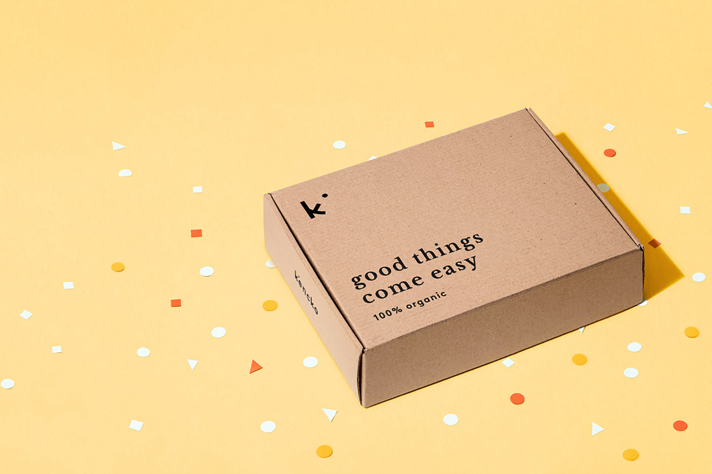
Love Street Studio created the packaging design and identity for Kencko, a brand devoted to reinventing convenient organic fruit & vegetables products. As the name translates as 'healthy' in Japanese, Love Street Studio developed an identity in which the letter K is inspired by its Japanese character (Kenkó - 健康 ). The logo seeks to emphasise the organic powder which defines the final product.
Creator: Love Street Studio