Oat Studio
N/AFebruary 10, 2023
Mindsparkle Mag


The founders of Kiki approached
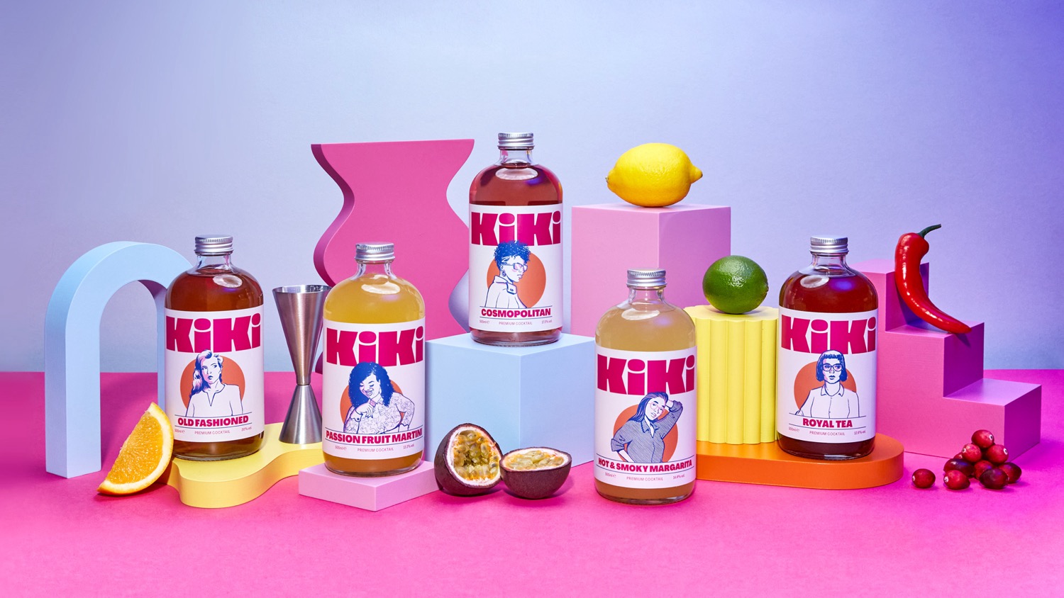
to rebrand the identity and packaging for their premium cocktail brand, as their previous packaging hadn't been working for them. Part of the brief was to maximise the impact of the brand on the shelf. Previously the logo had been relegated to the side of the bottle and the illustrations had been low contrast and overly complicated. Oat Studio stripped back the label design to its purest elements logo, illustration and product name.
Kiki is defined as a gathering of friends for the purpose of gossiping and chit-chat, which fitted with the idea of sharing cocktails anywhere, from a house party to a picnic in the park. Social gathering is represented by the illustrations of different people all based on regular customers from the founders London cocktail bar. Oat's designers created a curvy and characterful logotype, and the chunky letterforms were designed to fill the space at the top of the label. Like on a fashion magazines masthead, the illustrated characters overlap and interact with the logo.
In opposition to rival brands, they wanted the colours to feel warm, welcoming, punchy and fun. Using a distinctive hot pink, bright orange and deep blue sparingly on an off-white base, the high-contrast palette gave us the impact needed, whilst retaining a fresh and premium feel. To extend the informal, conversational feel of the Kiki brand, and further identify each different cocktail, they have individual typographic slogans which can be discovered on picking up the bottle. For example, the Cosmopolitan has a Sex and the City reference And just like that, helping cement the brands light-hearted character, and creating ideal social media content which customers have loved to share.
The final outcome is a unique and engaging brand for Kiki, that perfectly captures its playful fusion of company, conversation and cocktails.
Creator: Oat Studio