Algoritmo.Design
N/ASeptember 09, 2021
Mindsparkle Mag


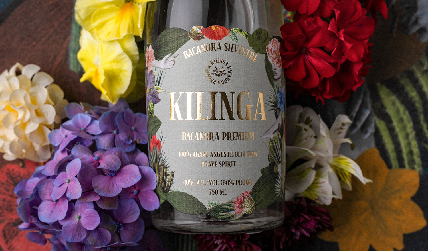
Today, we're traveling somewhere you won't usually pick as a holiday destination. Located in northwest Mexico, Sonora has plains and mountains, desert and beach, shrimp and deer. Among its diversity, Kilinga, a distilled agave company, is born and willing to take its place internationally. Algoritmo Design was in charge of making this happen by creating a luxurious brand and visual identity, elevating the craft of Bacanora making.
First, it was crucial to define Kilinga's purpose and then map the way to expand worldwide. The studio helped a once forbidden agave distilled alcohol find its place with a unified vision as the foundation for a new brand identity, packaging, campaign strategy. The two insights are to attract consumers' minds through smell and taste. And captivate them with Bacanora's astounding history represented in an authentic, mystical, and charming perspective. Kilinga is La Señora's nickname: qué linda, how lovely. Her passion, joy for life, and relentless pursuit of excellence are all reflected in her namesake. So, Kilinga Bacanora crafts to make her proud. Another essential feature of the brand's concept is the desert. In art, literature, and dreams, it symbolizes spiritually cleaning. Kilinga’s brand identity and packaging reflect wildlife charm in the form of a collage. To be challenged and stimulated, but also to experience awe and pleasure. Like the desert, which is a tough place with hidden beauties in it, mostly hidden. The vast majority of the beverage industry brand graphics are male-driven. Hence, Algoritmo's designers thought it would be valuable to exalt the feminine side of the brand, the Kilinga persona.
Overall, the brand's aesthetic has an incredible mysterious side filled with nature inspiration from the Sonora desert and its cultural background. The secret intention behind; is to experience the sturdy character of northern Mexican culture, its stunning textures, and odd pairings.
Creator: Algoritmo.Design