NM Type
N/AOctober 22, 2018
Mindsparkle Mag


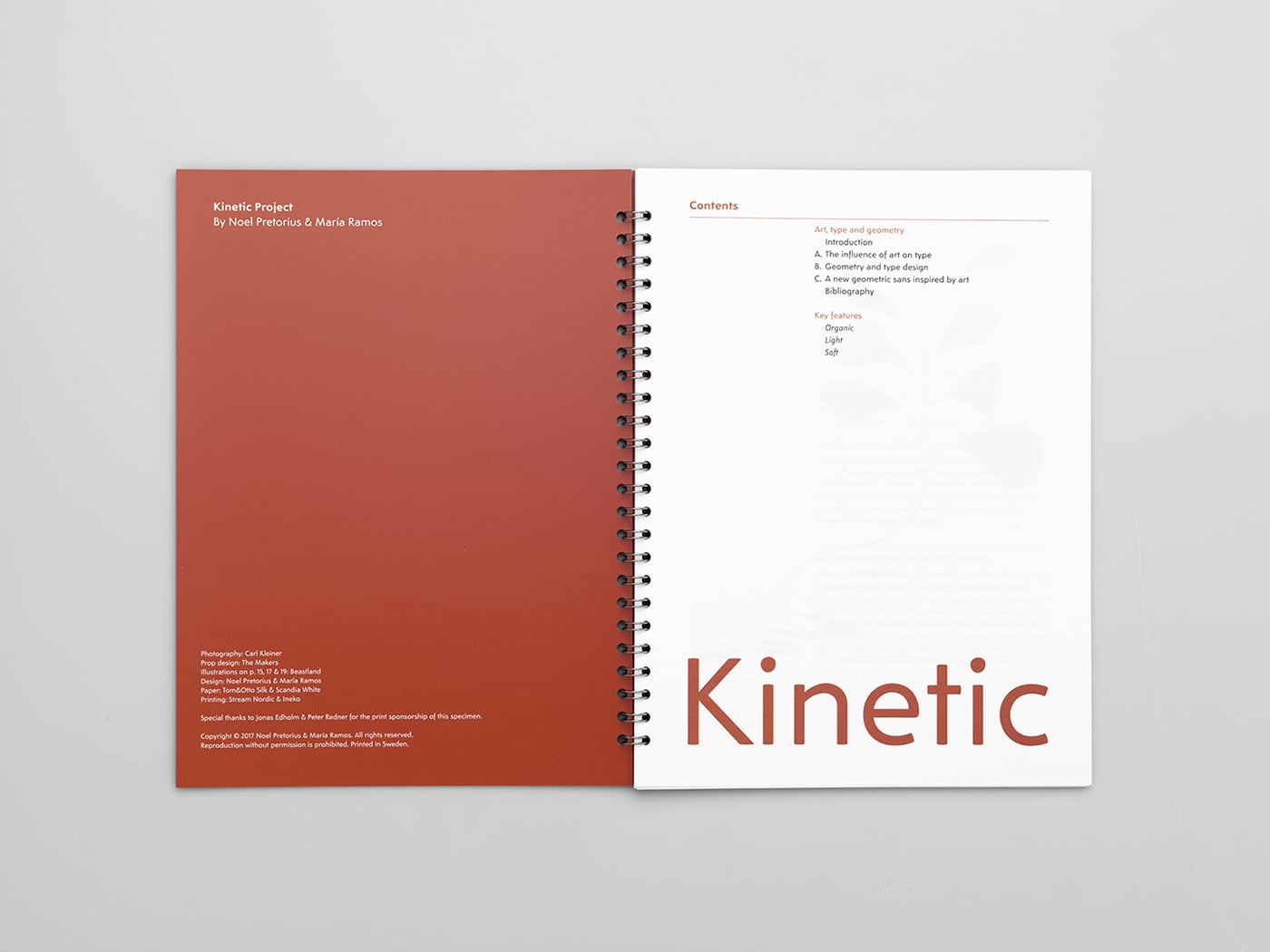
Kinetic is a geometric sans-serif family that draws on the simplicity and playfulness of Alexander Calder’s art. Geometry is present in the structure of the characters but not in a mathematical manner. Kinetic adopts a new approach for the design of a geometric sans by introducing a more organic appearance in text.
The playful proportions, the large apertures and the long ascenders make for a distinctive typeface. It is a unique design that renders well on screen and looks good in printed text. The slightly curved endings reference the bleeding of printed type and give the characters a softer feel on screen.
Kinetic is a crafted design that comes in 3 weights with italics. It is a modern text typeface that feels comfortable to read. The design is intended for a wide range of applications, which include advertising, branding, web and editorial design.
For the release a Notes App for iPhone was developed which allows users to create notes, lists, and reminders with Kinetic. Adding something new to the traditional way of releasing typefaces and allowing designers to test the typeface for free on small screens. A limited-edition type specimen completes the promo material. As a part of the specimen NM type have written an essay to provide context to better understand the design decisions behind Kinetic.
NM type is a collaborative type foundry between, Noel Pretorius (Sweden) and María Ramos (Spain). They met in England while obtaining the MA in Typeface Design at Reading University. Kinetic, their first retail typeface in the market, was awarded by the New York Type Directors Club. They have also done worldwide custom designs for international clients such as Jägermeister. NM type are a design team with a goal of finding new ways to shape the alphabet.
Photography, Carl Kleiner
Illustrations, Beastland
Kinetic sculpture, The Makers
Creator: NM Type