Bureau Rabensteiner
N/AApril 12, 2017
Mindsparkle Mag


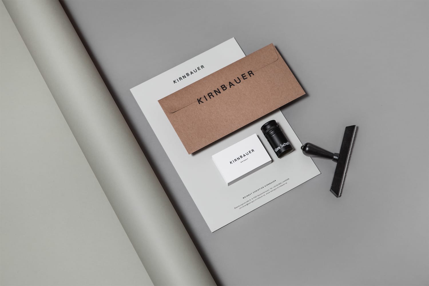
Authentic. Straightforward. In line with the zeitgeist. The Kirnbauer marketing materials and packaging are predominantly made from natural premium paper. They stand for authenticity, heritage and working with nature. The minimalistic design and the elegant finish provide a discerning and innovative appearance. A refreshingly new kind of elegance. Design of Bureau Rabensteiner compliments the bold character of the wines. It makes reference to the ornate, split, baroque labels that have served as a sign of quality for so many years. Wine-making has undergone a transformation. ‘The more, the better’ is no longer relevant. Today, everybody increasingly pay attention to the ingredients wines do not contain. Higher quality and hygiene standards have produced lighter wines in line with our modern lifestyle. Dusty wine cellars have been replaced by open architecture. This transition is reflected in the Kirnbauer products.
Creator: Bureau Rabensteiner