Koppel Studio
N/AApril 12, 2018
Mindsparkle Mag


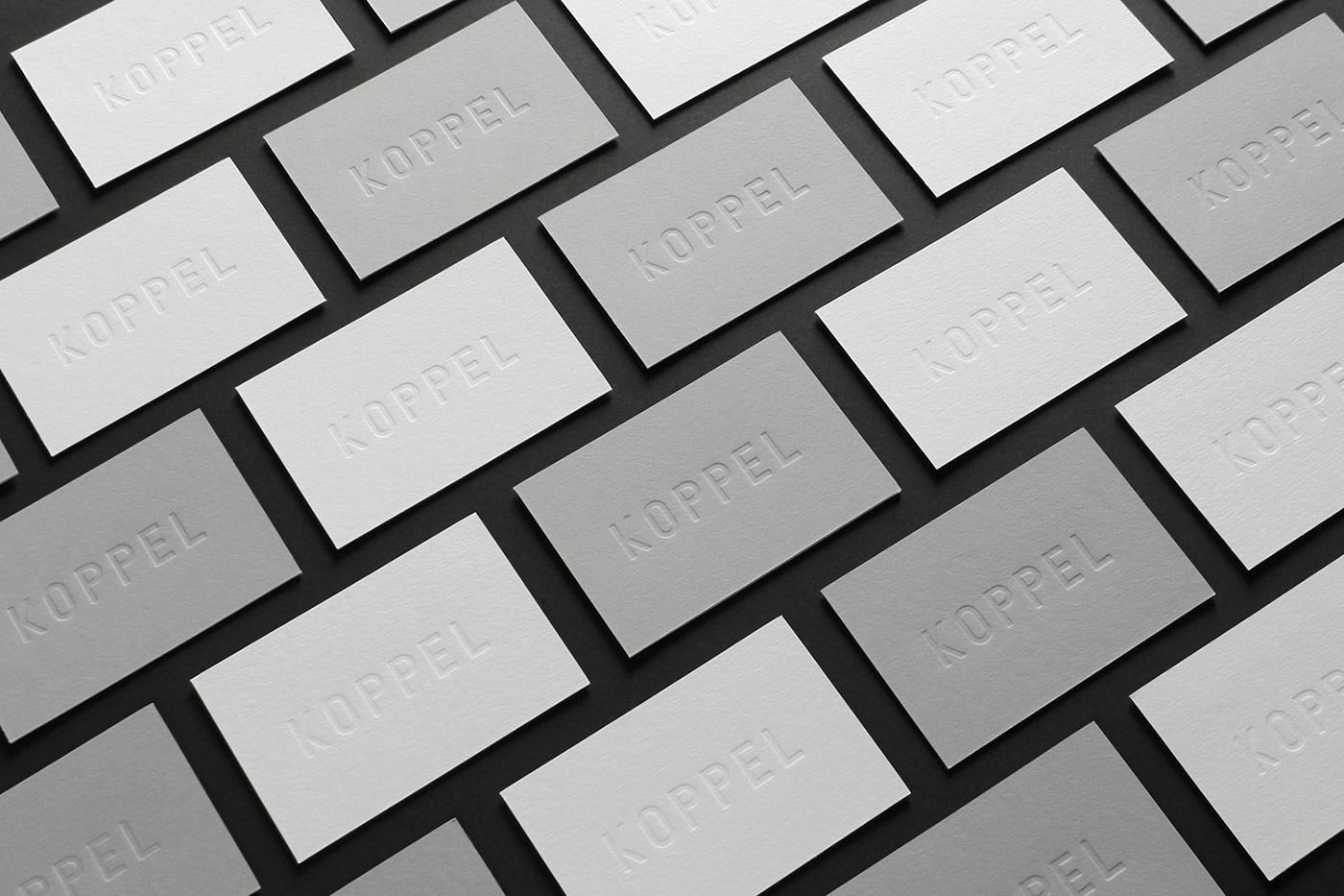
Koppel Studio designed their own minimalistic yet modern self-visual identity based on simplicity and traditional techniques.
'The custom logo typeface was ratio formed and eventually pressed into the paper, using the authentic letterpress technique. Two different papers – GF Smith Colorplan 'Real Grey' and 'Ice White' – were assembled with a technique called 'duplexing', where papers get merged together. Despite the use of duplexing, the blind letterpress logo is not visible on the other side of the cards. The cards were eventually cut clean using a steel die cutter, instead of the 'common' guillotine cut method.
The choice of these authentic techniques makes for an overall elegant and timeless identity that reflects the characters of both Koppel's founders.'
Creator: Koppel Studio