Minoru Higa, Ronald Pizarro
N/ANovember 23, 2023
Mindsparkle Mag


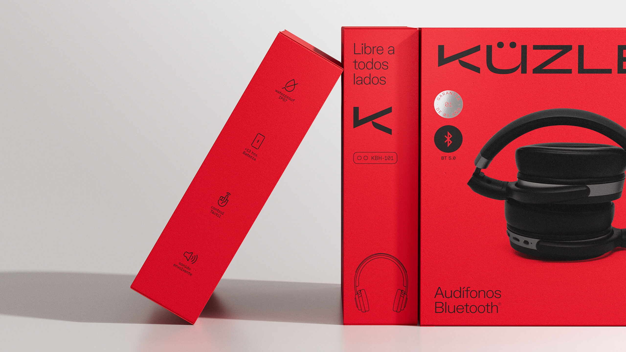
Küzler. Simple living. Technology Efficency.
The Brief: How to build the credibility of a technology brand to serve the basic needs of everyday life? How do we align ourselves to the new standards of technology of the future? Breaking the white color paradigm as a category identifier.
The Solution: With just over 3 years in the market, Küzler in the Peruvian market, renewed its brand perception accompanied by a DNA that encompasses the final goal of good performance of its electronic products: Vívelo Simple. The simplicity of the good, the functional and the effective. The proposal of a new simple and dynamic visual system that allows easy understanding of the benefits of each product in their portfolio.
Turning the main brand asset into a visual enhancer. From the analysis of the possible opportunities of the brand, Minoru Higa & Ronald Pizarro focused strategic efforts on giving a sense to the color they already used: the color red. A color that provides the necessary highlight within technological neutrality.
Simplicity and nothing more than simplicity. The common denominator for all graphic decisions made for the brand. A visual language that combines the functional, the technical and the neutral to give rise to a system of packages easy to read and understand.
"Before we were not looked at, today we are the brand that -breaks the visual scheme- of the gondolas and, moreover, is already considered by the largest business stakeholders, both in the traditional channel, as in the modern one." -Gianfranco Panizo, Küzler General Manager.
Since the renewal of the brand, we have achieved what until 2 years ago we saw impossible: the consideration of placing our products in all channels. We are about to expand our lines and in the future be able to offer our products internationally.
Creator: Minoru Higa, Ronald Pizarro