Algoritmo Design
N/AOctober 01, 2021
Mindsparkle Mag


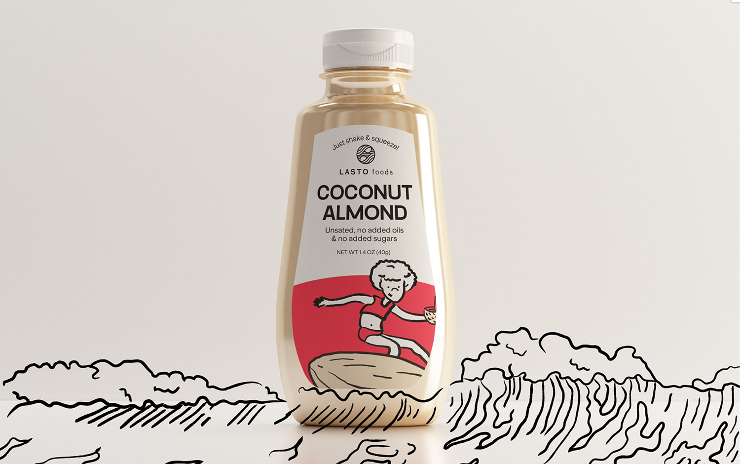
Today we're traveling to beautiful California to present Lasto Foods's brand identity for the silkiest nut butter in the world, crafted with love with 100% natural ingredients. Algoritmo’s design team was creatively in charge of the brand strategy to articulate the unique personality of Lasto Foods. And a brand identity system that could work across print and online applications, including packaging, social media, and illustrations for advertising.
Creatives managed to create something fun, accessible, and functional for Lasto Foods' communication campaign. The protagonists of this branding project are the illustrated characters the team has created. These jolly figures make you smile :) What's best is their energetic personality and how they interact with the packaging in a sportive way. For example, practicing sports, surfing, doing yoga, gardening, climbing, or any activities that promote happiness and well-being. To do so, the team proposed a 3D model of packaging to intervene with the characters. Plus, creatives came up with a stunning color palette featuring vibrant colors and modern typography, which a similar one was included on last week's Top 10: September Fonts.
The overall identity gives a healthy feel and without losing humor. We love the lively approach Algoritmo studio created for Lasto Foods. This is our invitation to surf in some buttery waves and enjoy the work
Creator: Algoritmo Design