Studio Marcus Kraft
N/AApril 07, 2022
Mindsparkle Mag


Studio Marcus Kraft has designed a distinctive corporate identity for the new Swiss champagne retailer LES BULLES.
LES BULLES was launched by four founders from the Zurich area and offers champagne and other specialties from the Champagne region that not everyone knows (yet) and are of uncompromising quality.
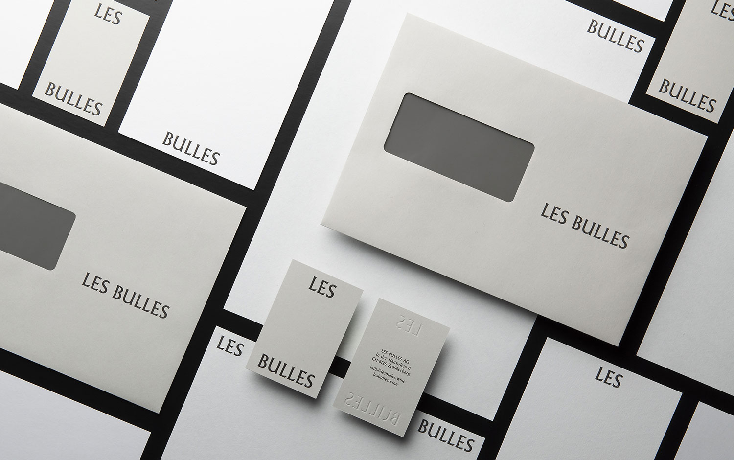
The newly designed appearance convinces with its simple yet at the same time striking typography. "The logo is based on a typeface created in the 1920s and 30s, in the heyday of champagne. In large sizes, it has a unique character. But it can also be used very legibly in small sizes as scrolling text," says art director and designer Marcus Kraft. Precious materials and embossing, plus a specially created monogram derived from the wordmark, give the brand a high-quality feel.
Since the company cultivates a very personal relationship with its mostly young winemakers, a trip lasting several days was undertaken to the vineyards with the renowned photographer Zsigmond Toth. The result is a series of photo reports that provide an intimate glimpse behind the scenes of the production of the fine champagnes. The pictures can be seen on the website and in a publication created by Simon Trüb about the LES BULLES winemakers.
Also on the website are some original details from oil paintings by old masters, which form a distinguished counterpoint to the otherwise usual imagery of the wine industry. The glossary on the website deserves a special mention: Complicated terms from champagne production are explained here with a wink and lightness.
Creator: Studio Marcus Kraft