Hue Studio
N/AAugust 15, 2018
Mindsparkle Mag


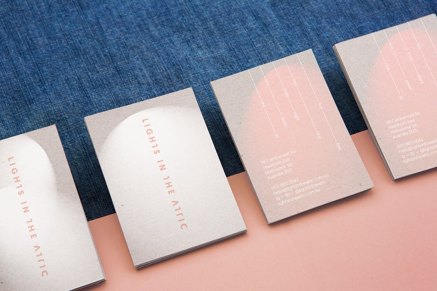
Beautiful branding and interior design for Lights in the Attic, a cafe in Melbourne by Hue Studio.
The whole branding is inspired by the name itself. With custom lettering, the logo is clean and simple yet unique. And the whole nuance of the branding resembles lights that fall on wall surfaces. Stamping method is used to brand the coffee cups as it is cost-effective. Their uniqueness is resembled in the menu as well; with headings such as “Something Lighter” and “Something More”, Lights in the Attic offers beyond your usual cafe experience. Architecture and interior by Architects Eat.
Creator: Hue Studio