SDCO Partners
N/ASeptember 25, 2021
Mindsparkle Mag


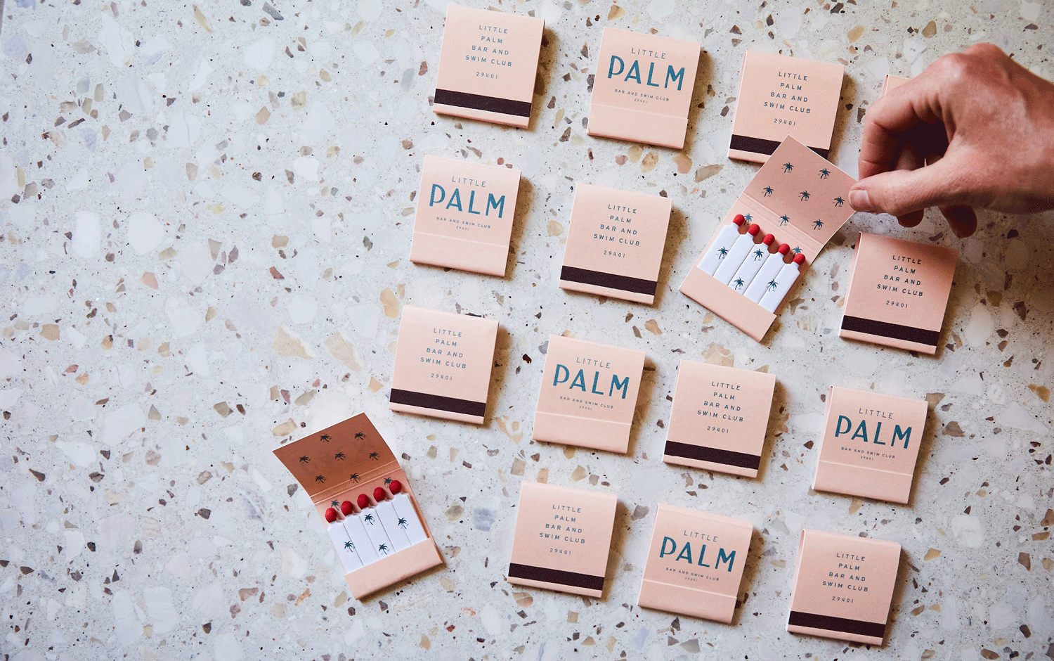
Some days, we want to leave everything behind and start a new life under a palm tree. But not literally; we found a cafe and cocktail bar named Little Palm with a breezy aesthetic designed by SDCO Partners. It looks like paradise on Earth, with a daydream soft color palette and a vintage style.
SDCO Partners' team was in charge of Little Palms' brand identity, stationery, and signage design. Located inside The Ryder Hotel, the bar's 50s aesthetic features some modern touches in its interior design, like the long vertical aquamarine tiles, which are super trendy today. Its visual identity includes an adorable, tiny palm tree pattern used in some of the elements designed. The choice of all-caps typography gives Little Palm's branding project a beachy-inspired feel, which transports us back to summer days. The good ol' days with friends and cocktails 24/7. Creatives managed to bring the beach to an inside location. Plus, there's a game with typeface's weight to make Palm the protagonist.
All in all, SDCO Partners nailed Little Palm's branding with its vintage, beach style and adding pastel colors with some metallic touches. We'd love to order some Tequila Sunrises at the ba, seating in those tall stools. Would you join us?
Creator: SDCO Partners